Saul Bass Brochure
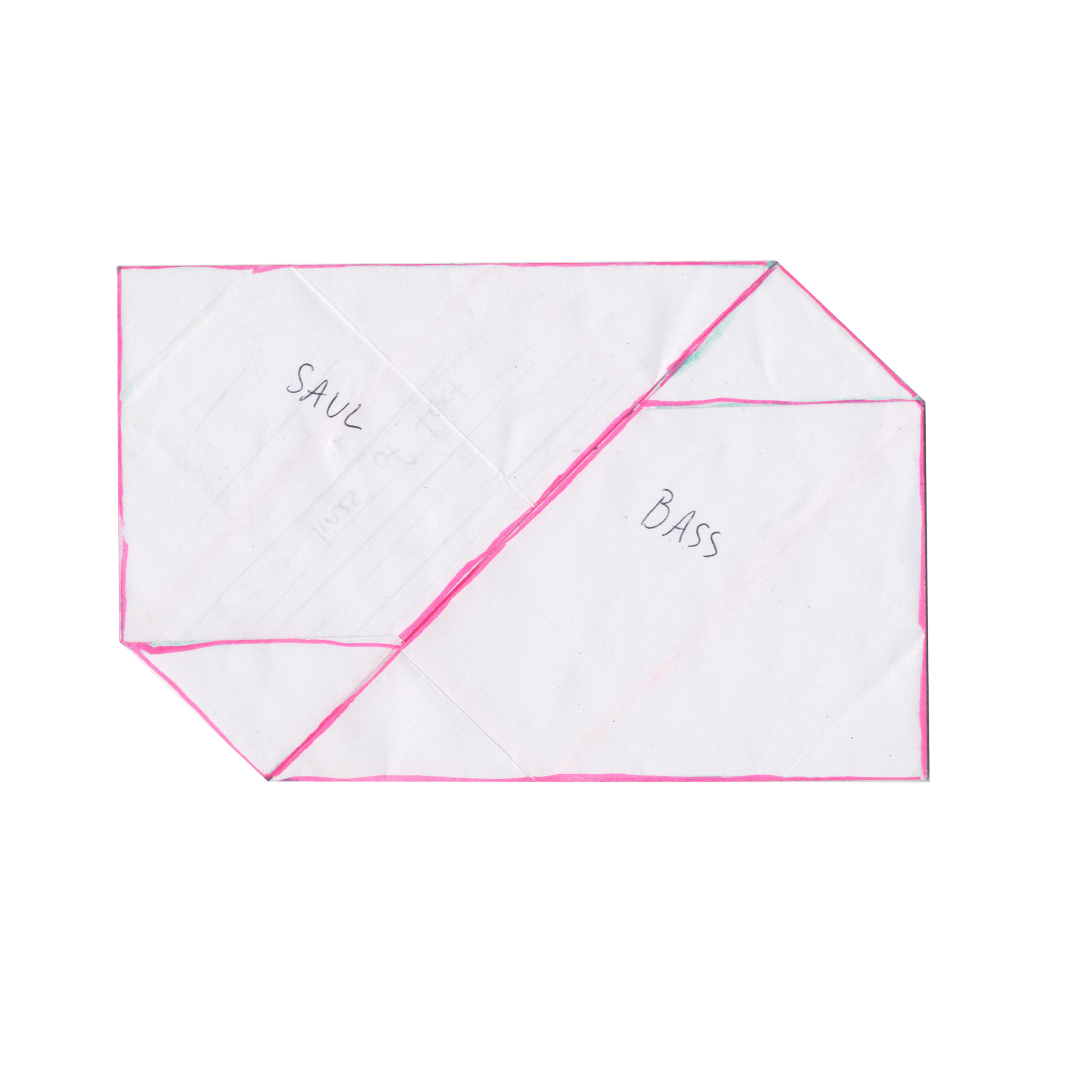
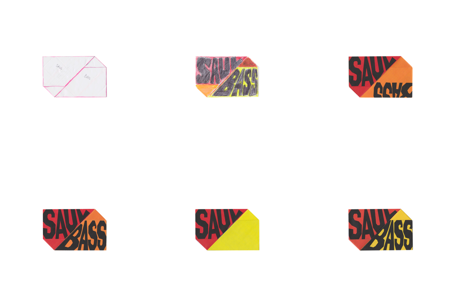
Creating a brochure on Saul Bass's life and work was an interesting exploration of text, image and user experience. I decided to use an origami fold to give it a distinctive look and experience, each fold lends to both the physical and metaphoric unwrapping of Bass's achievements. The muted primary color scheme is enhanced by the red-brown toned paper. Thetext and images engaged with the creases in the paper, resulting in a layout that felt both organic and visually appealing.
The Process
I wanted the brochure to pay homage to Bass's signature style. His bold graphics and typography paired with saturated colors and straightforward composition were a source of inspiration. I largely referenced his work in cinema, both movie posters and animated credit scenes.
The process of getting the brochure from my initial sketched mockup, into inDesign and then printed and folded into a deliverable piece was riddled with trial and error. Alignment, leading, font-size were adjusted more times than countable!


