Getida Rebrand
To give Getida messaging a bold and confident voice, we opted for FK Screamer, a condensed font family, for primary headlines. This decision to go all-uppercase was influenced by the previous Getida logo, which featured an all-uppercase lettering style. The new font choice builds on this legacy and reinforces the idea that Getida's messaging is more than just a name — it's what we say and how we say it.
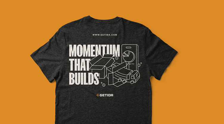
We can portray Getida's values and services through our dynamic marketing iconography. The marketing iconography evokes feelings of enthusiasm and dedication by employing light and expressive line work, which carries into the illustration style.
Be sure to check out the case study to get the full scoop.
---
Looking for a brand agency? We would love to hear from you.