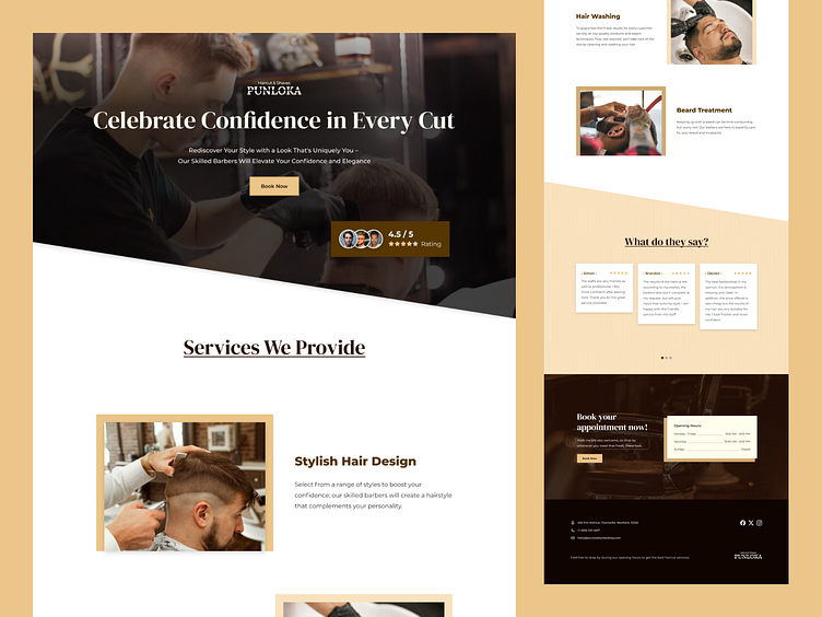
Punloka Barbershop - Landing Page
Hey designers,
I'm excited to present the landing page design for Punloka Barbershop. With a strong emphasis on user experience, every detail has been carefully crafted to ensure seamless navigation and easy understanding.
Let's elevate the user journey together with this design showcase! 🚀
• • • • • • • • • • • • • • • •
📝 - Brief
"Punloka", a barbershop, wanted an attractive and functional landing page to promote their services online.
They desired a design that reflected a masculine and modern atmosphere, with the use of black, white, and cream accents reflecting their brand identity.
Information to be displayed includes services, schedules, and contact details for appointments, as well as testimonials or reviews from previous customers.
Additionally, they wanted a clear call-to-action button to direct visitors to the ordering page.
Visual displays should feature high-quality images of barbershop interiors and the latest haircuts, along with easy-to-read fonts that match the brand identity. The design must be responsive for all devices.
• • • • • • • • • • • • • • • •
Wireframe
Desktop
Mobile and Tablet
Thank you for taking the time to view my design!
I truly appreciate every insight and suggestion you provide.
With collaborative and constructive feedback, I'm confident we can create even better and more engaging designs. So, please feel free to share your thoughts.
Thanks again!


