Management Dashboard Software UX/UI Design
Hey!
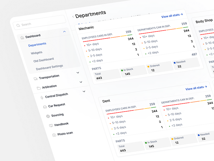
We would like to introduce you to our new case study. Platform that allows to manage supplies, availability and needs of car spare parts for various departments.
In terms of design, we tried to make it look as clean and pleasant as possible, so that all the focus and attention would be on the data, so that it would be easy
and comfortable for users to operate with it. That is why the main design theme is white.
If we look at each department, it has a set of similar metrics, which in turn makes this element available for formatting into a table. The table is a convenient tool when working with a large amount of data.
We made a small flat with segments that are colored according to the legend.
In fact, this is a capacity bar, or a ratio scale. It is quite simple, does not create information noise, and will be quite informative in case of disproportion in metrics, as a single very wide segment will be immediately visible on the scale.


