Swiftsight- Logo Design

Introducing the dynamic new logo for Swiftsight Logistic Services—a blend of innovation, speed, and precision! 🌟
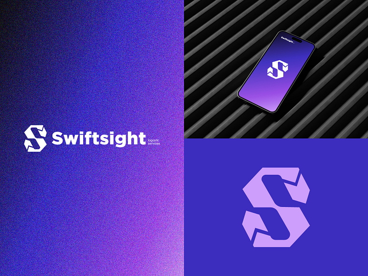
At the heart of this design lies the letter "S," symbolizing the swift and seamless movement that defines Swiftsight's logistics solutions. But that's not all—take a closer look, and you'll notice the clever integration of an arrow, pointing forward with determination and purpose. It's a visual representation of progress, efficiency, and forward momentum—the very essence of Swiftsight's commitment to delivering results, every step of the way. 💼
🔍 Behind the Design
The letter "S" embodies strength, reliability, and sophistication.
The arrow signifies direction, progress, and continuous advancement.
The combination of both elements creates a harmonious visual identity that resonates with Swiftsight's brand values and vision.
Have a project in mind? Let's work together!
Get in touch ─ [email protected]