Hyperproof | Rebrand

Hyperproof came to LPDS to enhance their brand and create a suite of assets to boost brand awareness.

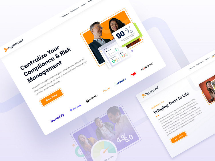
As a newer player in the market, Hyperproof needed a brand that would help them forge a stronger visual identity and ensure they stood out amongst the competition.
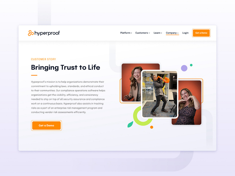
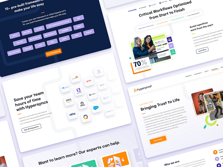
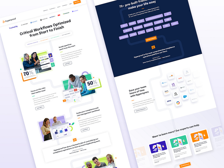
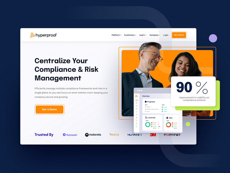
Simple geometric shapes are paired with vibrant colors to create a playfully accessible aesthetic, while infused linear elements act as journey lines to visually narrate the story of their product.
—
LPDS
Agency capability, in-house availability, with no overhead or time-to-hire.
Consider it done. lorenpolster.com/consultation