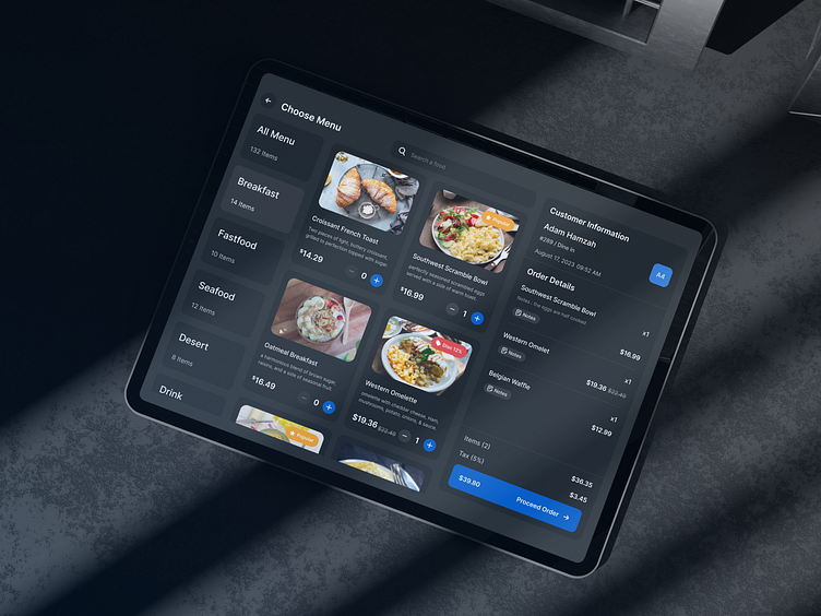
Bitepoint POS App - Choose Menu (Dark Mode)
Hello guys 👋,
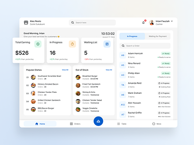
This is our latest UI kit product called Bitepoint. Is an application that makes it easier for cashiers to record orders for restaurant visitors and makes it easier for users to track orders, income, raw materials, etc.
This is the Choose Menu preview screen. On this screen, Users can see the menu list, menu categories, order details and bill amount.
Choose Menu Page Preview
What do you think ? Let me know your Awesome Feedback.
Press "L" if you like it.
Thank you!!
Our Product | IG | FB | TW
This shot is featured with Agensip
---
We are Agensip, a creative digital agency focusing on UI and UX stuff. Kindly visit our website at www.agensip.com to see more detail about us. Never hesitate to contact us via email at [email protected]
More by Agensip UI UX Agency View profile
Like


