Gemelo AI Voice Library (Mobile)
UX Improvement
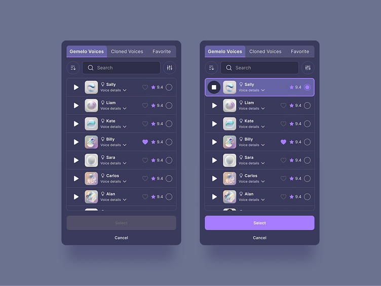
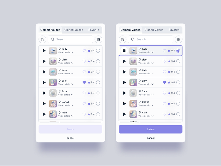
It's great to see progress in any aspect of work. Compare these designs to my last post and discover the UX changes for yourself.
All the filters are now hidden under the circular button, making the UI cleaner and easier to use.
A new option has been added: sorting, available on the left circular button, where you can decide how your voices are displayed.
The checkbox selection in the circle button has been replaced with radio button selection, as it is clearer that it's a single choice, not multiple.
Additionally, the category tab has been slightly updated in component design, making the active tab more visible.
What do you think? Are these good UX improvements?