Givematch | Colour Palette
Colour palette exploration for a charitable organisation's visual identity
Whatever someone gives to charity via Givematch, they earn a donation match to double it as they encourage their followers, friends and family to donate through their personal link.
Reaching a pivotal moment in the company's journey, Givematch had begun evolving their provided services and needed to explore and introduce a more mature colour palette to reflect their positioning.
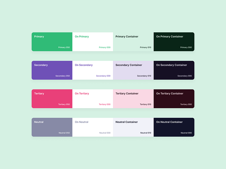
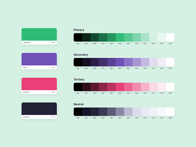
I adjusted their current green and dark blue, introduced purple and pink as additional options for application, and developed a scale of shades for each.
More Links