Coffee Hunter mobile app case study
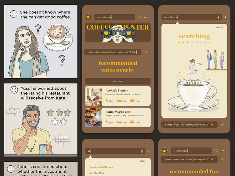
A user journey map is a great tool for getting you out of the interface-centric design mindset. After reading the map, project members notice the business and psychological aspects related to the designed solution. We also pay attention to the place, time and atmosphere in which the user uses the product.
Enter your text herI am passionate about comics and illustration. I came up with a great idea to use my skills and create a user map in the form of a comic book.e...
Enter your text here...The first version ends with Yusuf worried. Additionally, we have a high risk that Kate will not have time to create an account in the application. Something needs to change.
We lose some benefits by removing the need to create an account and the ability to rate the cafe, but we reduce the risk of a successful launch of the product on the market. We can add these functionalities in subsequent iterations of the project if users need them.
Enter your text here...In this version, we get a nice ending where each participant ends the journey with a favorable last impression of contact with the application.
I will present here the key screens for the user's main path in contact with the application. It is all about the process of finding a café that suits the user.
Please note that in the application there are two fields responsible for finding cafe recommendations. One at the top, the other at the bottom. The lower field is responsible for the location, which is the starting point for selecting proposals.
The speed of using the application is the key to success. Mechanisms such as autosuggestions in the search process can be very helpful in this matter.
Because I love creating illustrations, I add them to my work wherever I can. A series of interesting, changing illustrations can make waiting for search results as enjoyable as an animation.
Recommendations are automatically sorted according to their distance from the entered point. The lack of user ratings would be compensated by a screen presenting the restaurant. It would include a description and photos.
An experienced UX designer once told me, that nothing convinces investors to invest in a project better than, visualizations of the finished product at the end of the presentation :)


