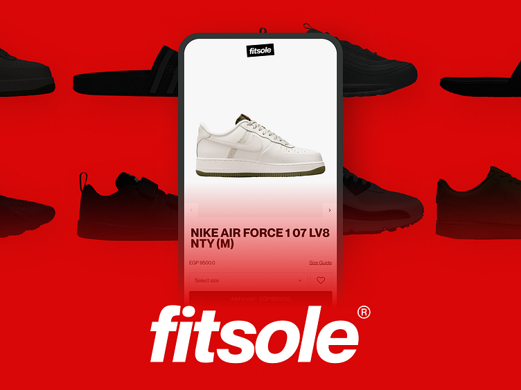
Fitsole web recreation
Why Fitsole, you wonder? It's not about a revamp but tackling Figma challenges head-on! Exploring components, constraints, and auto layout, this e-commerce venture became my canvas for dealing with design intricacies. 🎨💻
Mobile Mimicry: Fitsole on Your Phone Screen 📱
Step into the mobile scene! 🚀 Recreated the Homepage, an Article page, My Bag, and the Checkout—all neatly within a sleek double-column layout. Shades of gray, pops of red, and a serene white backdrop. 🌈 Check out the prototype here.
Desktop Discovery: Navigating the 4-Column Terrain 💻
Same content, but a four-column dance. Mastering layout grids, autolayout, and constraints became the name of the game. Challenge accepted! 💪 Explore the desktop prototype here.
Figma's Endless Learning Journey 🚀
No redesign here—just an immersive dive into Fitsole for the sheer joy of learning. As a self-taught Figma enthusiast, each tutorial, course, or self-discovery adds another layer to my design arsenal. The potential of Figma seems limitless, and the exploration never ends. Here's to the continuous learning journey, where every new skill learned is a step towards quicker and more effective design executions in the future! 🌌🔍


