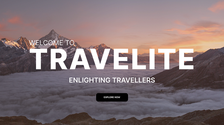
Travel website landing section
This the the landing section for a travel application named Travelite. It features the heading in bold to draw attention of the user to the main name. It also includes the text "Welcome to" which is common in all the slides of the carousel (Slides are shown below) and tagline for each slide. Proper contrast has been maintained in font size. Each slide features a background image and for perfect taste of the destination the image has been overlayed with a gradient of color which represents that place. (For eg. Kerala is a state full of forests and greenery so the image has been overlayed with a gradient of color #1F703F).
More by Kanak Khandelwal View profile
Like


