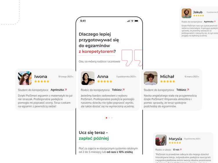
Mobile landing page. PolSmart
Design for a Mobile landing page 5/6
About
PolSmart is a unique online platform that provides students with the opportunity for quality learning with teachers in an online format.
The audience comprises students of various ages, and for maximum effectiveness, individual landing pages have been created that offer precise information tailored to the needs of each age group.
The objective of the project was to develop the design for a landing page specifically geared towards preparing students for 8th-grade exams.
Review
Reviews are a crucial component of the landing page. They contribute to building user trust and help them better evaluate the quality of the educational experience on the platform.The design of the card for PolSmart is crafted to clearly indicate who left the review – a parent or a student. It also specifies which specific teacher the review is for, with the option to directly navigate to that teacher's card.
Full Case Study on Behance
Like it? Appreciate it!
