The Golden Words • A lettering process
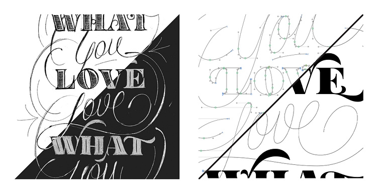
The process of this lettering wasn’t simple for me. A few days of sketching were needed to find the right style. I was absolutely sure that the idea of combining these two styles - the calligraphy script and the massive serif - was a good one. I thought so until I started vectorising it. That’s when I realised my failure. I’m not a lettering expert and not a professional for now, so sometimes it's hard for me to look with an unbiased eye. But I hope I did it.
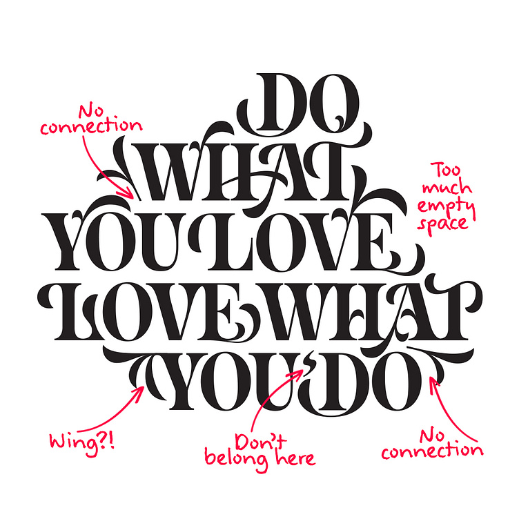
Enter your text heI realised that the serif is too massive for this elegant script and from afar, only 'what / love / what / do' will be visible, making it not make sense. So I decided to separate it into two different arts and started looking for a new style and composition for this serif. I wanted it not to look too much 'fonty,' and I still don’t know whether it worked.
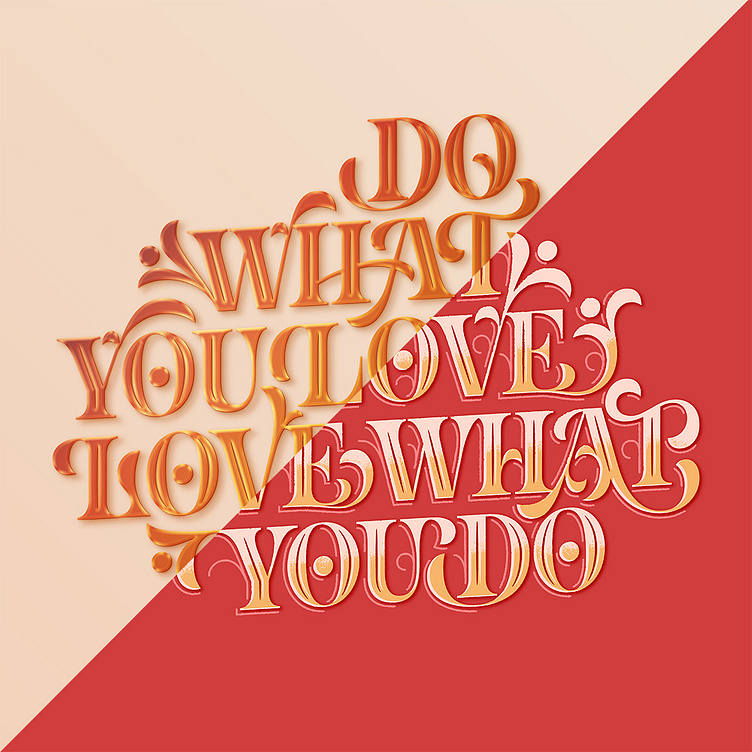
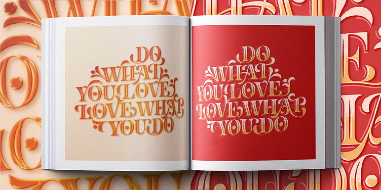
Enter your text here...Anyway, I finished with two styles for the serif - flat, crunchy 2D and pseudo 3D with this shiny gold typography.