Industrial Estate Brand Refresh
The Brief
The project's directive was to make subtle adjustments to the logo, mindful of the substantial investment in estate signage. The goal was to enhance the logo's boldness and ensure its suitability for the industrial sector, without making extensive changes.
Subsequently, these modifications were to be implemented across all new marketing materials, including brochures, to let signage, hoardings, and leaflets.
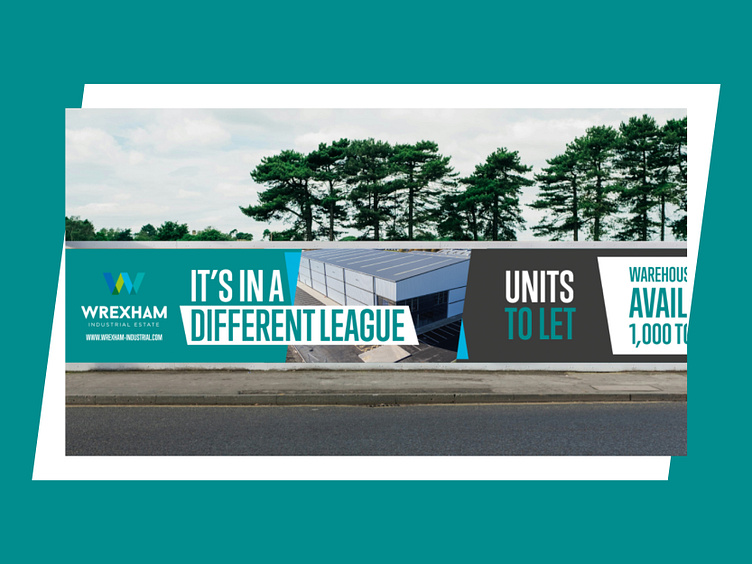
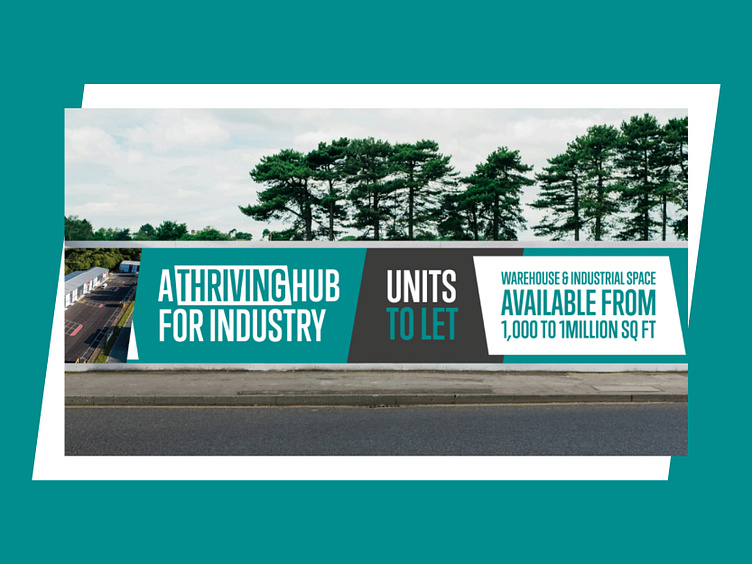
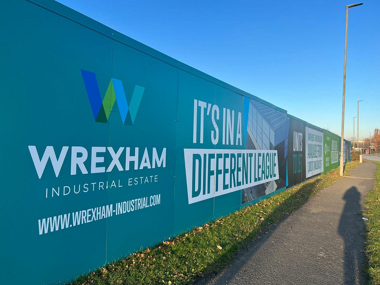
Hoarding Design
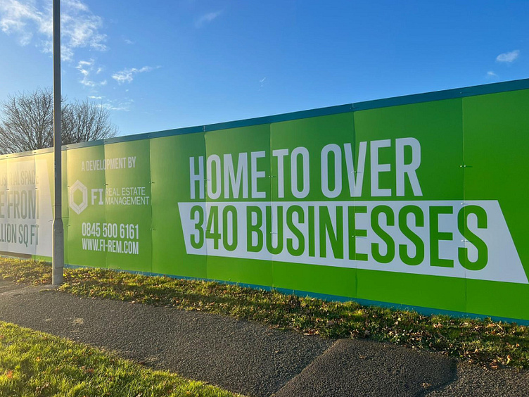
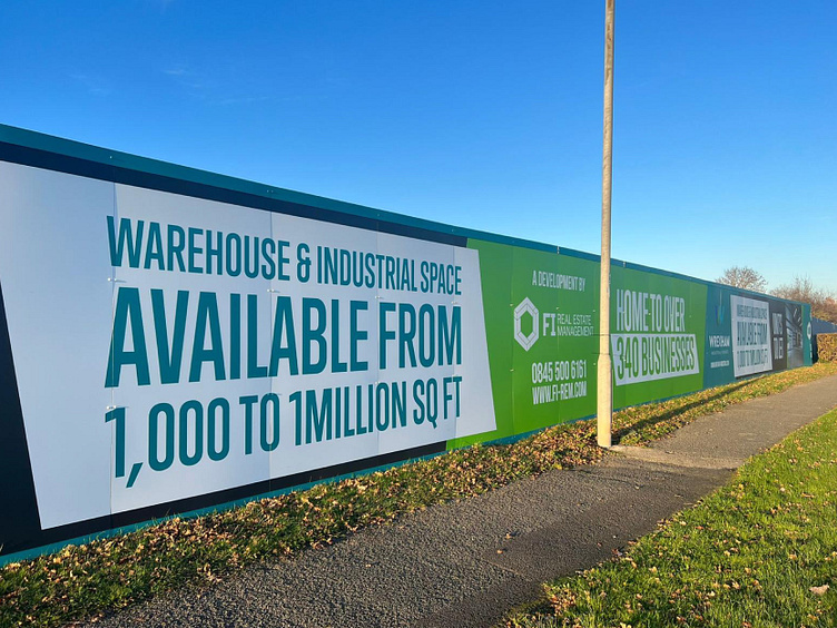
A crucial aspect of the project involved installing hoarding for a development on the industrial estate. Leveraging the new logo, I crafted a striking and bold design, aiming to convey the message that this is the premier location, the optimal choice for establishing and growing your business.
Above are the concepts and below are the finished designs in real life.

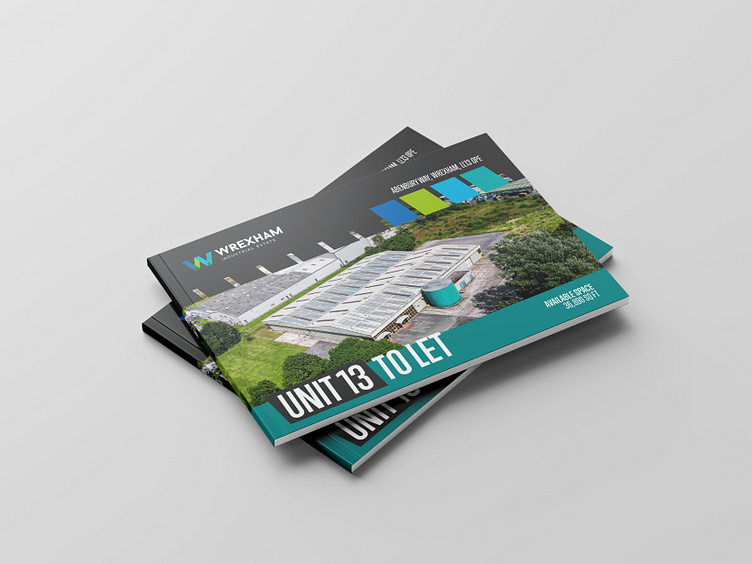
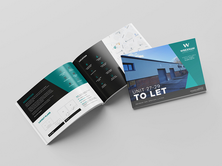
Brochure Layout Design
The design transitioned seamlessly and proved adaptable across various media types. Presented below is a brochure showcasing one of the units, highlighting the successful application of the design concept.
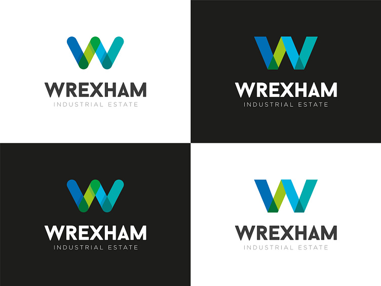
Logo Tweaks
In the comparison provided, the left side features the old logo, while the right side showcases the updated version. The incorporation of sharper lines in the new design proves more fitting for the industry, allowing for the implementation of more robust design styles. Notably, the introduction of chevrons contributes to a powerful design language.
The second slide reveals a streamlined color palette, reduced from the previous 12 colors to create a more concise and effective visual identity.

Thank you for taking the time to view my project and any constructive feedback is always welcome 🤗