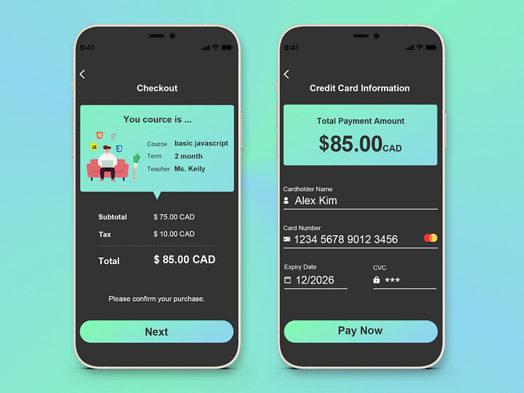
#DailyUI 002 // Credit Card Checkout
Have you ever had a similar experience?
Have you ever experienced uncertainty while shopping online, especially when you reach the credit card input screen? Questions like 'Am I ordering what I want?' or 'What exactly am I being charged for?' might cross your mind. I've had moments where I went back to check and confirm, even going so far as to erase credit card information already entered.
This design focuses on reducing such unnecessary steps and uncertainties, aiming to streamline the user experience.
About the color
When you hear words like engineer, JavaScript, and coding, what color comes to mind? Many people might associate it with the black screen filled with seemingly complicated English and numbers. (If you have a different color in mind, please share!)
tarting with that, I decided to use black as the base.
Light blue and slightly yellow-green color
Light blue: Calm, cool, refreshing.
Slightly yellow-green: New shoots, new things, harmony.
These associations come to mind. It's a perfect color choice for those starting a new course in learning JavaScript.
