🌈 UX Design for The Trevor Project
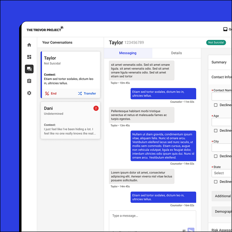
We worked with The Trevor Project to create a new platform for their crisis counselors to interact with LGBTQ+ youth in crisis.
Usually, the folks reaching out are having thoughts of ending their life, so it's critical for these counselors to be able to focus on their conversation, rather than struggling with the software in front of them.
We created an application after hours of UXR and shadow calls with the counselors and supervisors that scored:
21% higher in navigation ease
11% higher in counselors' confidence to do their job
and 30% higher in overall ease-of-use
This was a true testament to thoughtful design. We poured over their current case record and reimagined the information architecture to match the natural flow of conversation.
We found ways to utilize AI and other ways to have the system work for the counselor, so they could spend more time chatting and less time filling out the assessment.
We improved the search functionality to find old records.
This new system rolled out into Mexico for The Trevor Project's first ever launch internationally.
We were honored to work with an organization dedicated to helping folks in need.


