Music Portfolio Hero Design
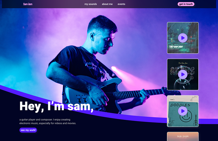
I designed this hero section for a musician's portfolio website recently. I wanted give the website a feeling of flow and motion, so I used an interesting shape for the image with a large border around it. I think it helps pull attention around the different areas, from the text to the albums. I thought portraying some of the musician's most recent albums would also be a unique way to get a quick glimpse of their sound and style. Let me know what you think!
More by Jordan View profile
Like


