Brand Identity Design - Graphic Agency
Project Overview:
The primary goal of this project was to establish a distinctive and memorable brand identity that would resonate with the audience and leave a lasting impression. I focused on infusing a friendly and approachable feel into the design, utilizing curves and rounded elements to achieve this objective.
The client operates a graphic design agency specializing in print design for business cards, flyers, ERP solutions, and brand calendars.
Client's Objectives:
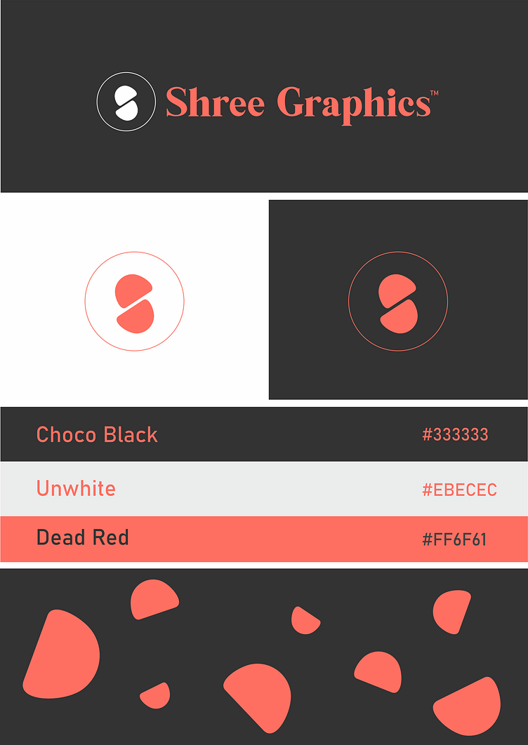
My client's key objectives were clear. They wanted a strong color combination and a brand presence that would be worth remembering. To meet these requirements, I selected #333333 and #EBECEC as primary and secondary background colors, respectively, with an accent in #FF6F61. This color palette aimed to create a distinct and memorable look.
These objectives heavily influenced my design decisions, leading to a contrast look with rounded shapes for a friendly yet impactful brand identity. The combination of red for strength and rounded shapes for approachability struck the right balance.
Design Process:
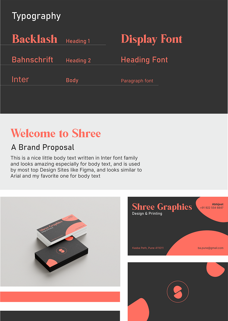
My design process began with the client's directive to establish a simple yet legitimate brand presence. To achieve this, I chose a Serif font – 'Backlash' for display, Bahnschrift for headings, and Inter for body text. This selection ensured a balanced and professional appearance.
Facing challenges during the process, such as color selection and deciding between a wordmark or an icon logo, pushed me to think critically about the brand's personality and how to convey it effectively.
Concept Development:
The overall concept drew inspiration from the theme of attention, symbolized by the use of reds, while maintaining a professional touch with black shades. Merging these elements seamlessly became the key challenge, resulting in a brand identity that captures attention while exuding credibility.
Visual Elements:
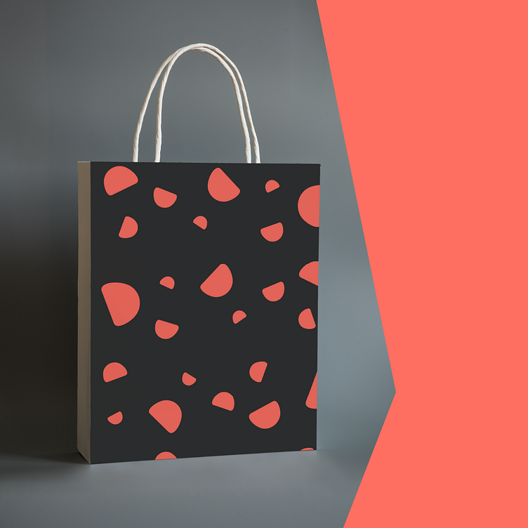
The primary logo features an 's' created with two circles and a round ring, a visually striking representation inspired by platforms like Dribbble. Following current trends, I embraced minimalism and incorporated blob shapes from the logo 's' into a cohesive brand pattern. The combination of an icon and wordmark as the primary logo ensures versatility and recognizability across various applications.
In conclusion, this project successfully met the client's objectives, providing them with a brand identity that combines strength, friendliness, and professionalism in a visually compelling manner. The thoughtful design elements and strategic decision-making throughout the process culminated in a brand that leaves a lasting impact.
