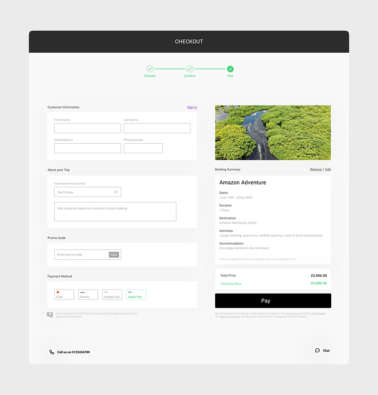
#DailyUI 002 - Checkout Page for Booking a Trip
The Challenge
Design a checkout page for booking an adventure to the heart of the Amazon Rainforest.
The Approach
In tackling this challenge, I opted for a clean and clutter-free checkout page. The design aimed to guide users through the checkout process seamlessly, minimising distractions. Headings were strategically emphasised for clear navigation, and the colour palette was kept to a minimum, ensuring a visually soothing experience and preventing sensory overload.
More by Mbo Ngwenya View profile
Like
