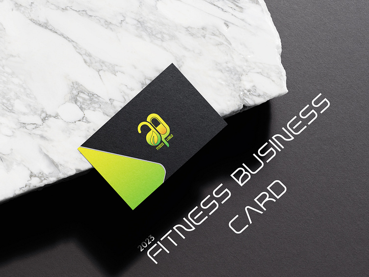
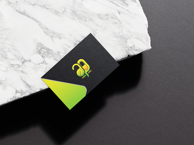
FITNESS BUSINESS CARD DESIGN

In the creation of this business card, I embarked on a journey to seamlessly blend form and function, ensuring a visual representation that resonates with both professionalism and innovation.
My inspiration:
The initial spark came from the willingness to create something pleasant and minimal. Drawing on minimalism, and attractiveness, I sought to capture a sense of elegance and simplicity
Conceptualization:
The design evolved through meticulous brainstorming and conceptualization. Each element was carefully chosen to reflect the essence of the brand and its values. I played with multiple design prototypes to strike the perfect balance.
Typography and Color Scheme:
Typography became a powerful tool in conveying the brand's personality. The choice of mixing two different font types communicates innovation. The gradient color palette, inspired by the brands logo, enhances the overall visual appeal, creating a lasting impression that never seizes to capture attention.
Layout and Composition:
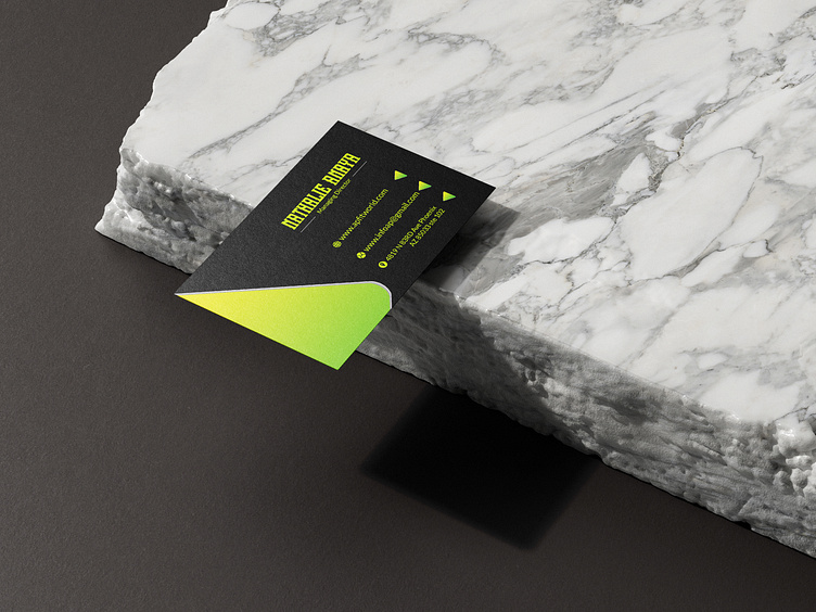
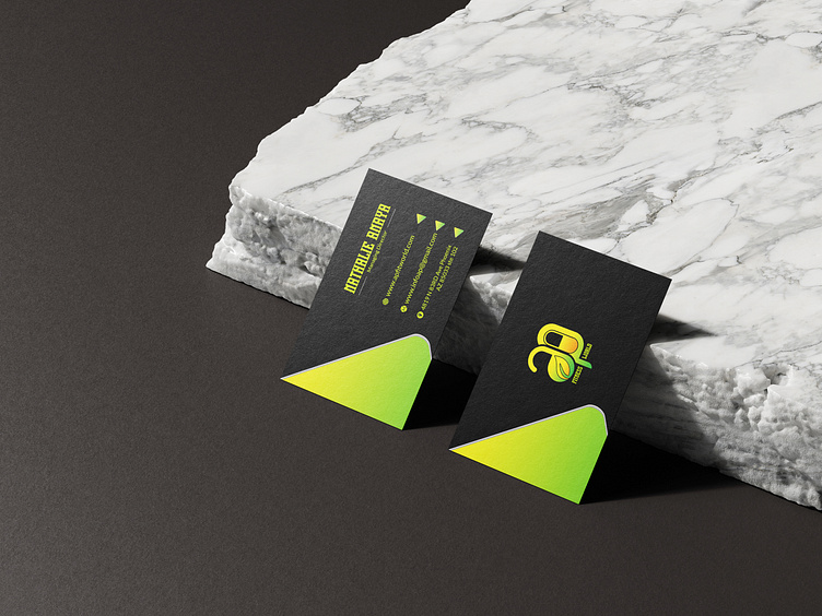
A thoughtful layout ensures that every detail serves a purpose. The placement of logo, contact information and other elements was strategically considered to guide the viewer's eye and maintain a sense of visual hierarchy.
Refinement:
Iterative refinement played a crucial role in achieving the final design. Soliciting feedback and making subtle adjustments ensured that the business card not only meets but exceeds expectations.
Conclusion:
This business card is more than a mere exchange of contact information; it's a tangible representation of the brand's identity. I invite you to explore the nuances of the design and discover the story it tells about “Amrappharma”.
Thank you for your time and attention, please let this not be your last time experiencing creativity, follow for more wonderful UI designs. See you soon DNCreatives✌️✌️❤️❤️