Case study | Sismo: The key primitive for Web3 identities


Project Information
Scope | Collaborative design exercise
Platforms | Web app
Timeline | Dec '22
Introduction | Project Overview
Disclaimer
Please note that the design deliverables included in this case study are for reference only and may not match the final designs used by Sismo.
Recently, I have written an introductory piece on Sismo which you can find here.
Introduction
As a part of a partially collaborative design exercise with Sismo, a Web3 product that focuses on digital identity and privacy-preserving solutions, I was asked to provide an interactive prototype of how their app's next version, Sismo App v2, would look like.
At the very beginning of this assignment, I decided on three general design principles:
The continuity of the user flow is to be signaled by both functionality and visuals.
The new app would move from a one-directional product to a multi-directional product.
Design scalability is to be taken into consideration with every single design decision.
Outcomes
The primary objectives of this collaboration were:
Merging two environments into one.
Making the app's user experience more interactive.
Displaying what badges the user is eligible for.
Displaying badge data in a user-friendly way.
Work | Sismo v2.0 enters!
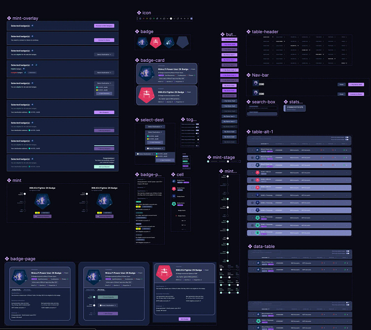
Even though I was provided a very light design system with few components, it was extremely limited, especially considering the scope of this assignment (an upgrade of the app, not only in terms of design but also in terms of functionality) and the very little time I had provided to complete it (one week, to be exact).
As I have noticed that most of my time working on this assignment would be spent on creating a much more extensive design system to ensure that the time spent on design is reduced and that a more efficient handoff at the end would be ensured; I have started to work on a design system, so minimal that no components of that I would not use for this assignment would not be created at the first place.
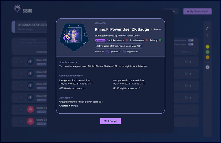
Badge View
It is accurate to say that Badges are atomic units of the whole Sismo product, and the way badge information is displayed is truly important for the ideal user experience.
When a user clicks on a badge on the current app, v1, a new page that displays the badge's information opens. As one of the core design principles I chose to follow for this assignment is to ensure the continuity of user experience, so that unless necessary, it is not disrupted, I have decided to make use of overlays to give users the sensation of a one-page app.
In fact, I strongly considered going even further and adding a tab view as below. The purpose of this tab view would be (1) to improve this continuity even further, and (2) to obtain a higher level of design scalability. Yet, per the team's feedback, we gave up on this idea; though, I personally still think that it is an idea at least worth exploring.
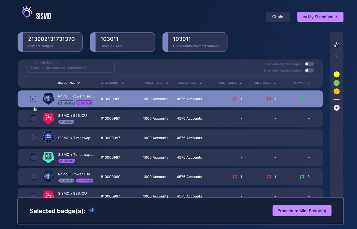
New Main Page
A new main page would have a table view consisting of two different kinds of badges, Curated, and Non-Curated ones, which had their own different user flows in two different environments. In addition, some statistics considering these badges and new interactions, such as selecting multiple badges, hover states, etc., were added to improve this page's visual design and functionality.
As the current version of the Sismo app did not allow its users to interact with multiple elements, one of the highest priority tasks was to create a delightful experience that enables users to interact with multiple elements, including selecting multiple badges and minting them only with a few clicks.