Employee Dashboard

Introduction:
The project commenced when I observed the existing dashboard within our company and recognized the potential for improvement in terms of both aesthetics and user functionality. Motivated by the vision of creating a more engaging and user-friendly experience, I initiated a comprehensive case study.
Research Phase: The journey began with an in-depth research phase, exploring user needs, pain points, and industry best practices. Insights from user feedback and discussions with key stakeholders were instrumental in shaping the redesign strategy.
Wireframing and Iterations:
The initial step involved creating wireframes that outlined the structural framework of the dashboard. These wireframes evolved through several iterations based on feedback from both end-users and senior design colleagues. Each alteration aimed at refining the layout for optimal usability.
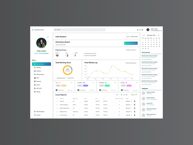
Mockup Development - Light Theme:
Upon finalizing the wireframes, I progressed to creating the first mockup, focusing on a light theme for a clean and modern look. The design prioritized intuitive navigation, ensuring easy access to essential information for employees. The layout was carefully structured to present individual and team metrics seamlessly.
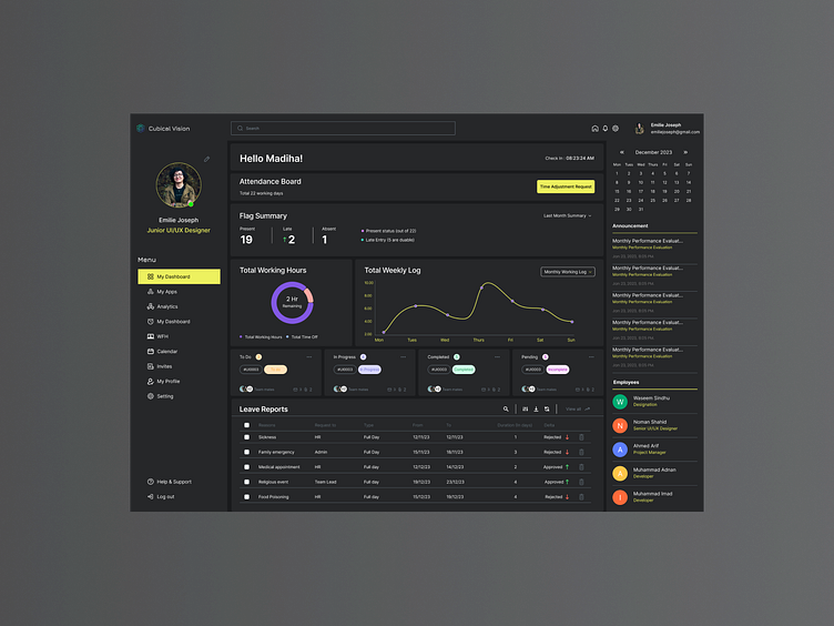
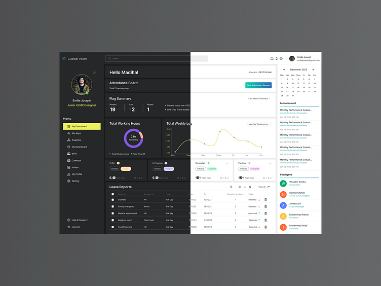
Dark Theme Implementation:
Recognizing the importance of customization and user preference, I extended the design process to incorporate a dark theme. This not only enhanced visual appeal but also catered to user comfort and reduced eye strain, especially during extended usage periods.
Key Features:
User-Centric Navigation: Intuitive pathways for easy access to individual performance metrics.
Team Overview: Team leads can effortlessly view and analyze the collective performance of their team members.
Performance Metrics: Comprehensive representation of individual and team performance statistics for informed decision-making.
Results:
The revamped dashboard successfully transformed the user experience, providing a visually appealing interface with enhanced functionality. The implementation of both light and dark themes ensures adaptability to diverse user preferences. Employee and team lead feedback has been positive, with increased engagement and a more transparent overview of performance metrics.
Conclusion:
The dashboard redesign project not only addressed the initial goal of enhancing aesthetics and user-friendliness but also fostered a collaborative approach through iterative feedback. The final result is a versatile and user-centric dashboard that aligns with the evolving needs of both individual employees and team leaders.