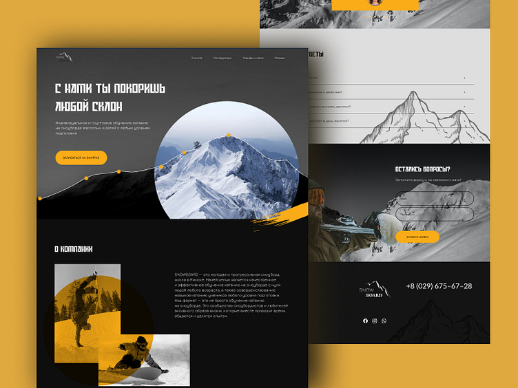
Landing page for snowboarding school #3
The design in dark tones using accent colors and elements creates a bright and modern landing page for a young and actively developing snowboarding school.The project was created during training.
More by Katerina Krautsova View profile
Like
