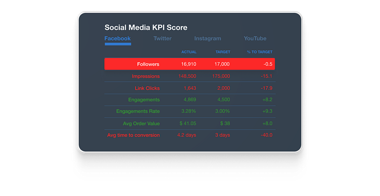
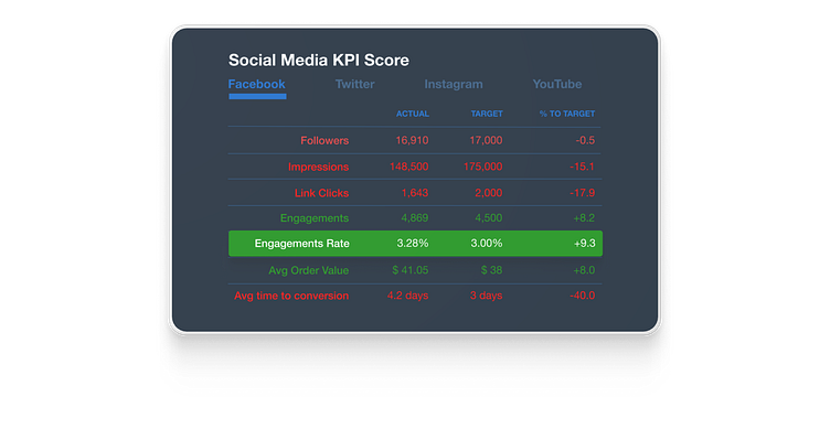
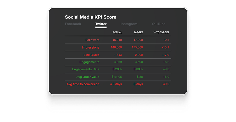
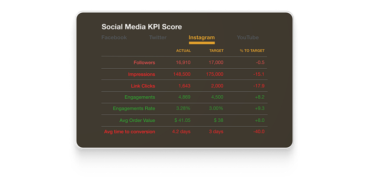
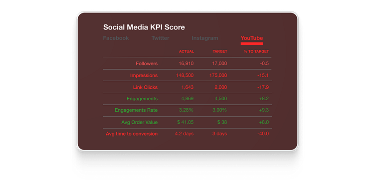
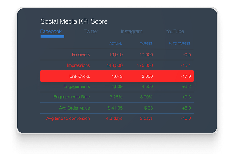
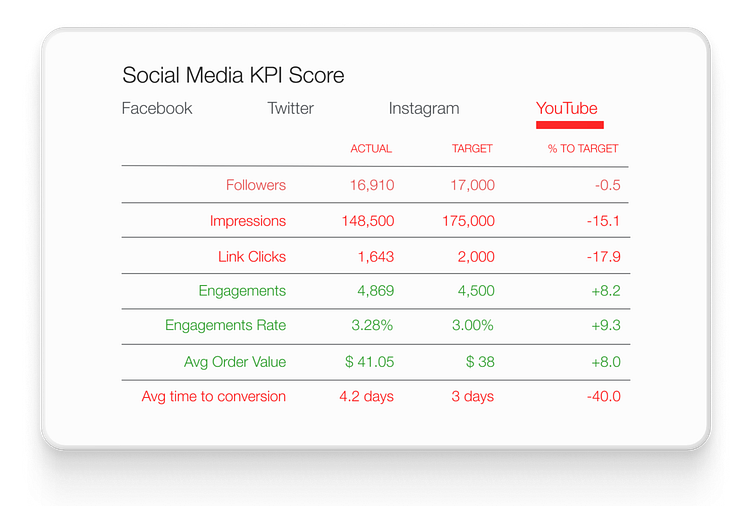
Daily UI (18/100): Analytics Chart

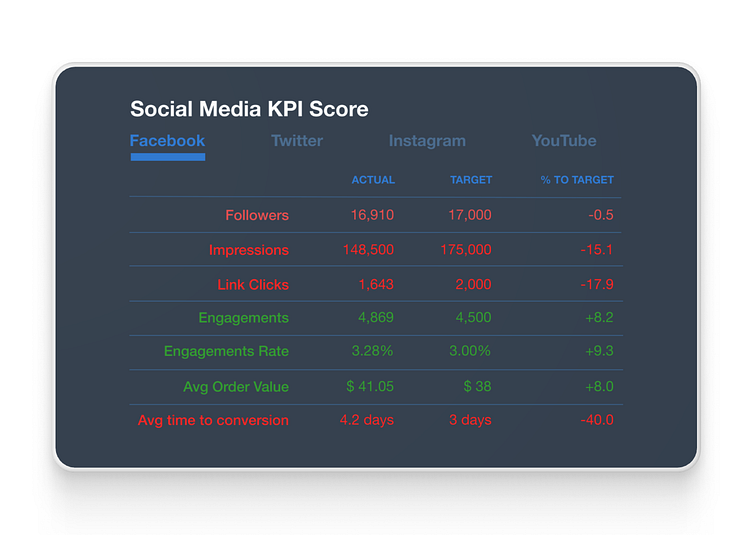
I researched what makes a good dashboard and/or analytics charts and I think that I come up with a pretty good solution: data is readable and familiar and I threw in a little bit of some animation to help engage the user.
You can take a look at the prototype at the bottom of the page or use this link to go to the Figma file. This is my first time designing something like this so if you have any advice or best practices that would be great.
NOTE: I just added 2 more flows/prototypes. The changes I made to these versions are 2 things: background color and typeface. Would love to know what you think about them and which version do you like the best and/or is more engaging?