The Brighton Group Redesign

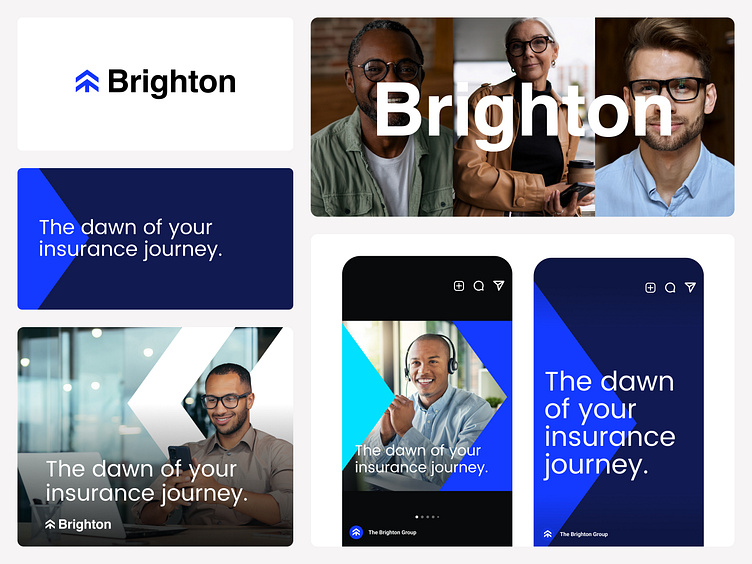
The Brighton Group's redesigned logo represents a significant evolution in their visual identity. The logo, embodying a minimalist and rectangular design, has been carefully evolved from the earlier arrow/tree motif used in their old logo. This refined shape is both dynamic and compact, harmonizing perfectly with our brand's forward-thinking spirit. This also allowed for a comprehensive visual language to be developed using this symbol as a base.
We wanted to play off the name and came up with the slogan "The dawn of your insurance journey" hinting at the word bright and linking it with the dawn.