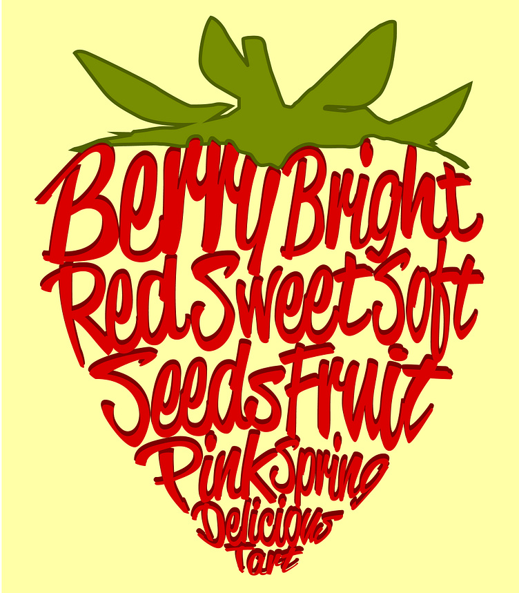
Strawberry Typography Illustration
Instead of a traditional typography portrait using an image of a person, I used an image of a strawberry and created the same concept. I also included a type study to decide on the best typeface to use. In addition to a color study to decide on the best aesthetic looking strawberry with a background color, and adding mockup of where a graphic like this could be used.
More by Laura Mills View profile
Like


