Sprocket Web /app Landing Page CTA Button Redesign


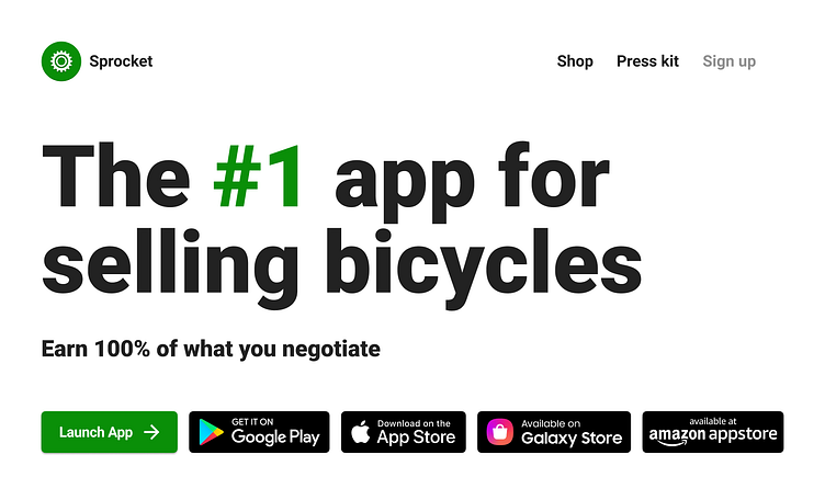
Redesigned our /app landing page to have more compact buttons that have a lower cognitive threshhold that works better in different layouts between mobile and desktop. I also updated the same button at the bottom of the screenshots under the header and leveraged this UI to add a 3rd row of them in the middle of the screenshots between 4 & 4 👁
If you like it, don't hesitate to click "L" 💗 or "F" + "Follow"
👇 Follow us and get the app now + review us 🌟
Sprocket Bicycle App on Android
Sprocket Bicycle Blog on Instagram
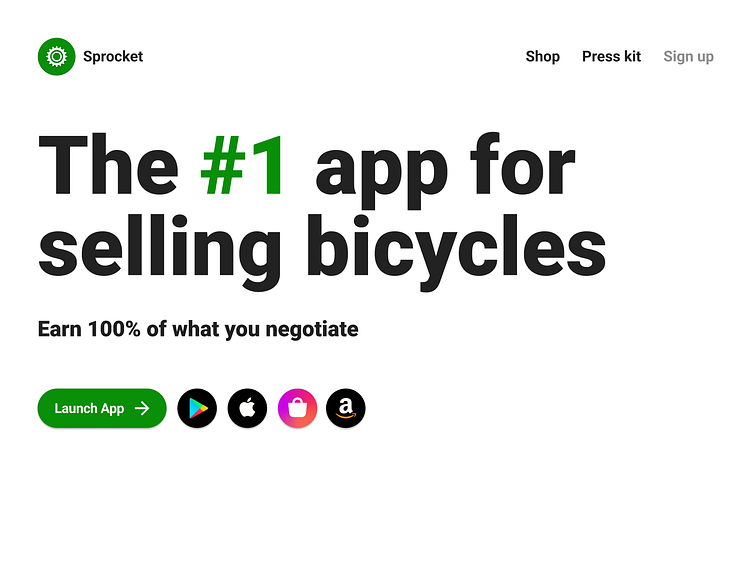
Previous design where once Samsung/Amazon were added our team was having problems figuring out how to code them to look great as the screen expands and contracts. And thats before we added a Windows Store one were adding rtn
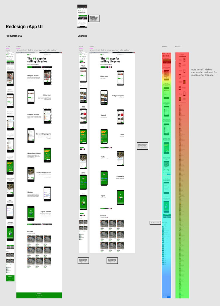
Hi-Fi mocks used for implementation and subsequent team documentation
