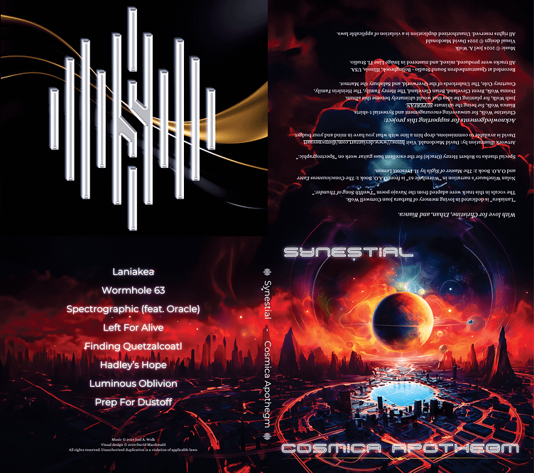
Synestial - Cosmica Apothegm CD, Cover & Poster Design
4-panel CD case insert. Front lower right, Back Lower left. The Upright line between the two on the bottom is the spine. The top right is the inside, and the top left is under the clear CD tray. --This CD will be released sometime in early January.
Close-up of the Logo created for him. Chromed, Double Shadow with Gold on a Black wavy background. I started with a plan flat black logo that the client was frankly ashamed of, He was sure it would be of no use to me but I turned it into this and he was blown away.
Rearrangement for the CD Print, the size required was not exactly the same as on the 4panel. Ended up making some manor adjustments on placement.
16x20" 600 DPI CMYK/8-Bit Poster. The client asked for a poster using the Art we had already created. I came up with this and he was extremally happy with it. He is going to have a bunch of them printed.
They have created a Facebook page if you are interested. The CD should be out soon. https://www.facebook.com/profile.php?id=61554784886103
~I'm David M. and I'm available for commission; shoot me a line.
See more of my Art Here: https://www.deviantart.com/digmynovaart
See More about what I'm into: https://digmynovaart.dribbble.com/


