M&N Construction | Logo
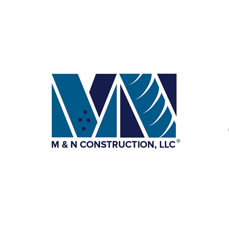
As one of my initial forays into real-world logo design, the emblem for M & N Construction, LLC, stands as an abstract representation of the company's core values and services. The 'M' incorporates stylized construction columns, indicative of stability and support, while the 'N' features a screw texture, symbolizing robust construction and endurance. This combination logo melds text and symbol to enhance brand recognition. The color palette, a spectrum of blues, psychologically conveys trust, security, and professionalism—crucial attributes for a construction company's credibility.

Agency: N Studio
Year: 2017