Logo design

The aim was to create a logo based on some key requirements:
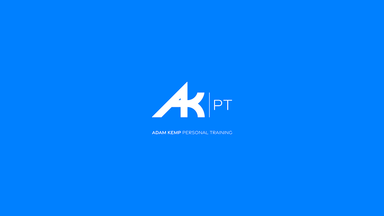
bold logo design using his initials (AK)
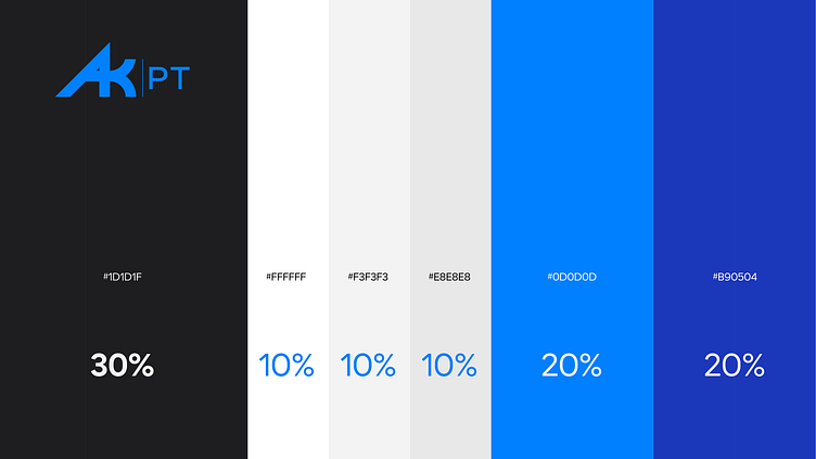
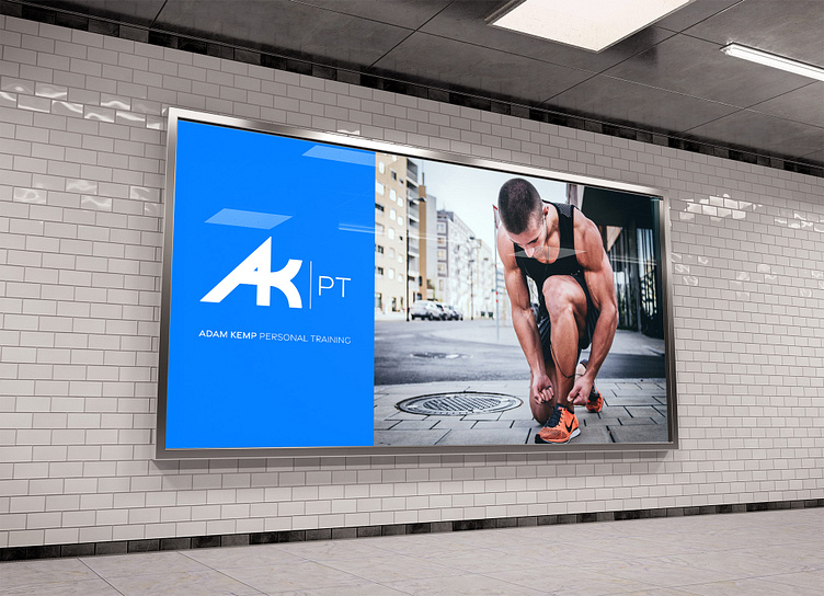
to have a colour palette based around blue
to appeal to all genders
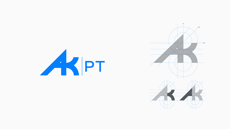
I created a custom mark in the form of an A and a K. These two letters were combined to create a unique shape that expressed energy and movement.
Using simple geometric shapes to create a form that has the appearance of a forward lunge.
In the image (above), you can see the separate forms of the letters A and K respectively.