5 years later, revisiting my logo

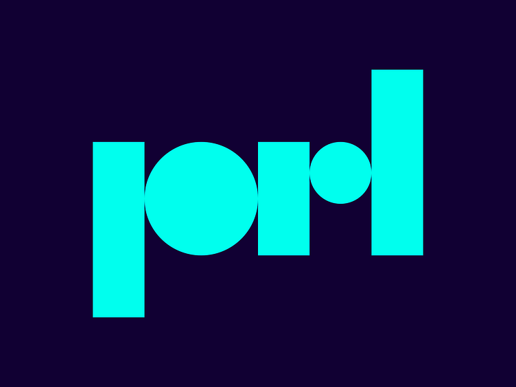
I’ve always thought the ‘p’ in the current iteration of my logo is too heavy in comparison to the other letters. That, and it breaks with the simplicity of constructing initials using simple shapes only. I think this subtle change improves things considerably.