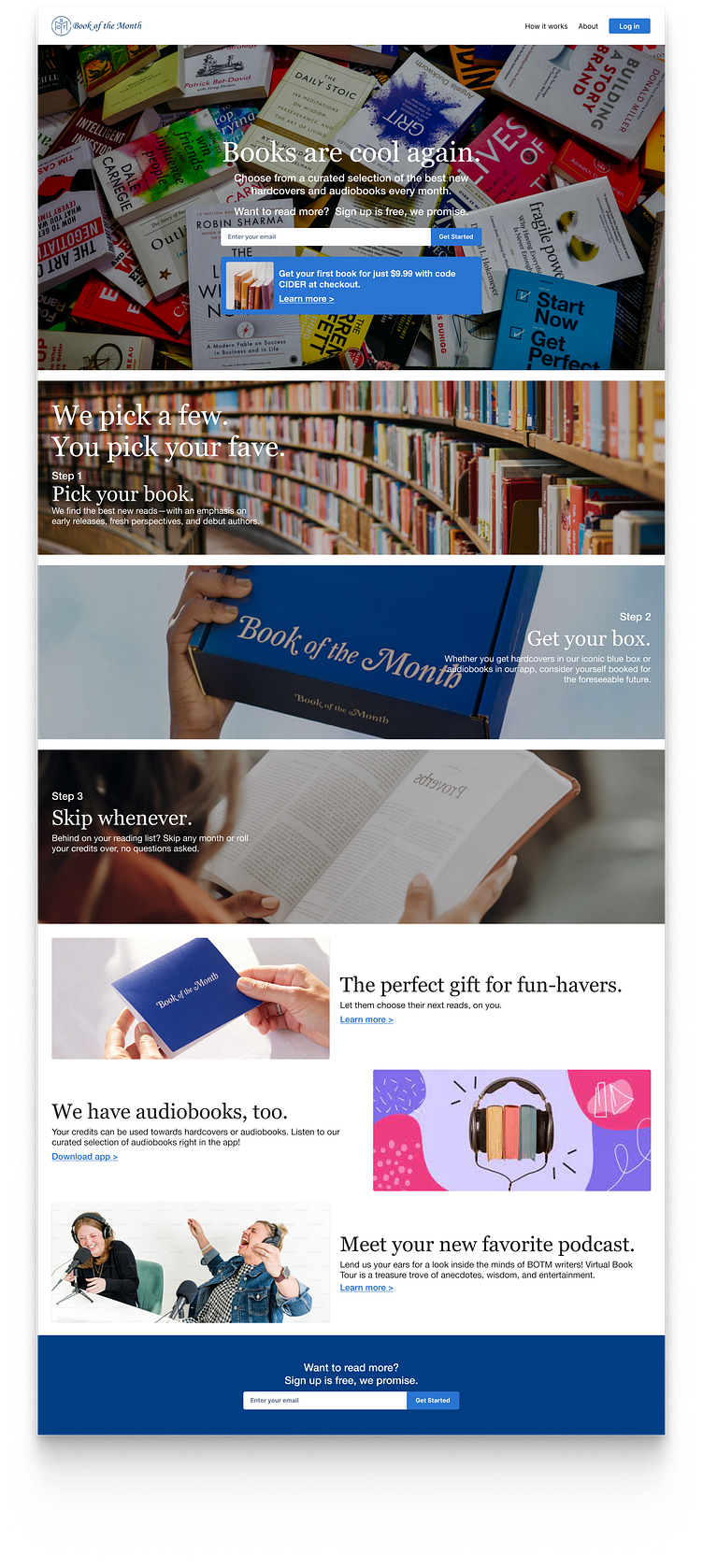
Daily UI Challenge (3/100): Landing Page
Daily UI Challenge 3/100: Landing Page
READING IS FUNDAMENTAL. In their application process, Book of the Month asks the applicant what changes would they make to the BOTM website in order to attract more customers. They asked that the recommendations be in writing so that's what I gave them.
I went back, however, and decided to redesign it. This is the landing page for today's UI challenge.
Take a look at the Book of the Month's original site if you'd like to compare (Note: It looks like they've changed a few little things here and there since I last saw it).
Or just check out the before and after shots that I've included below (before is on the left and the redesign/after is on the right).
I'd love to get feedback on whether or not my redesign has enough in it to draw users into it.

