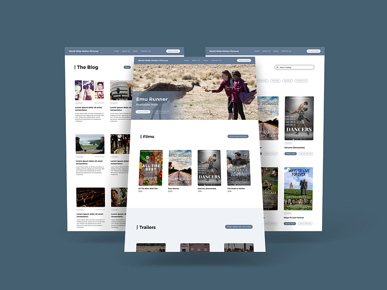
World Wide Motion Pictures Corporation
This was a new concept for the website I designed for World Wide Motion Pictures. The original website was built in WordPress. WordPress is widely known and as such makes it easy for anyone to update content.
Goal
To refine and enhance the functionality of the previous website while keeping usability simple.
Role
I was the primary designer and developer.
Strategy / UX
The page I wanted to tackle first was the catalog page. Currently, there is a long list of films featuring a "one sheet" and title for each film. There is no indication of navigation or call-to-action for the viewer to easily browse the catalog. This is what I aimed to change. The refined catalog page features a larger "one sheet" image and call-to-action buttons. It also allows the viewer to filter through different film categories, leading to a more enjoyable and less overwhelming experience. Once the catalog was refined, I spread the design elements to other parts of the project. This created a consistent design system.


