头疗品牌Logo提案 Head massage brand logo proposal


项目 —— 头等闲品牌升级1.0 ——logo设计提案
头等闲 —— 2023.10
服务 —— Mr.Chen ——品牌设计
品牌创建 - 标志设计 - VIS设计
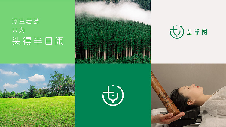
品牌简介 —— 头等闲是首个倡导通过针对头、颈、肩部的洗护按摩进而调理当下人们越来越普遍存在亚健康问题的健康休闲服务品牌。
经过企业开会讨论,最终确立企业的核心关键词
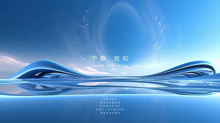
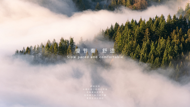
宁静 —— 放松
慢节奏 —— 舒适
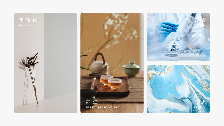
侧面关键词 —— 年轻化、养生、安全、品质
----------
Project - First Class Leisure Brand Upgrade 1.0 - Logo Design Proposal
First class leisure - October 2023
Service - Mr. Chen - Brand Design
Brand Creation - Logo Design - VIS Design
Brand Introduction - First Class Leisure is the first health and leisure service brand to advocate for regulating the increasingly common sub health issues among people through targeted cleansing and massage on the head, neck, and shoulders.
After a meeting and discussion with the company, the core keywords of the company were ultimately established
Tranquility - Relaxation
Slow paced - comfortable
Side keywords - youthfulness, health preservation, safety, quality
logo设计提案方案一
----------
Logo Design Proposal Scheme 1
正常状态下的Plan A的logo样式
----------
The logo style of Plan A under normal conditions
Plan A的灵感关键词情绪版
----------
Plan A's Inspiration Keywords Emotional Edition
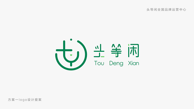
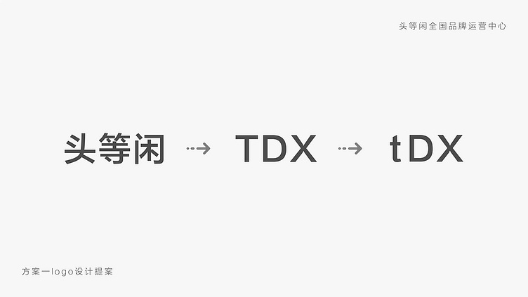
核心设计形式 —— 以头等闲的英文首字母TDX设计,再将大写T字母进行小写处理
----------
Core design form —— Design with the first letter TDX in English, followed by lowercase processing of the uppercase T letter
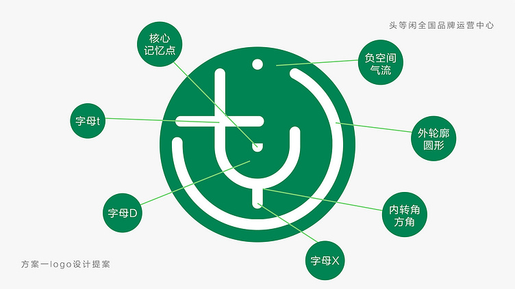
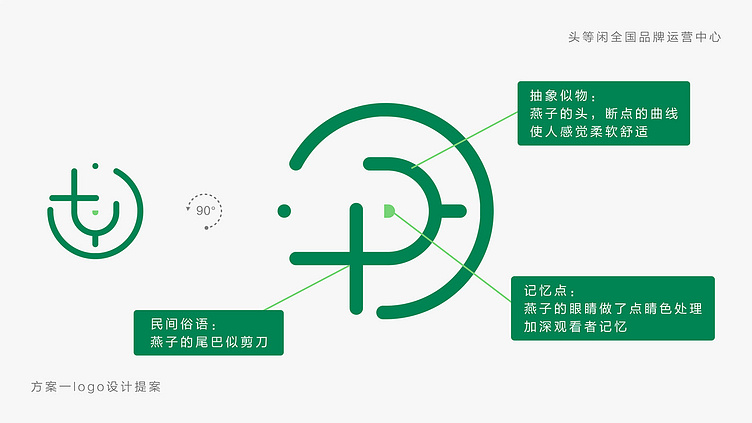
第一方案的logo外框采用的是圆形,大体采用的是外圆内方的设计形式
圆形是从古至今沿用最多的图形,所代表的是一种调和和容纳的文化理念
上下左右都是全对称的图形,具有稳定、美和动感的图形
但是完整的圆形过于死板和墨守成规,所以我们在外框上需要进行开口的设计
从风水学上说,气流是财富的运作,负空间也没有被阻隔,气流的流通也寓意这循环往复
在快节奏的时代背景下,没有人会盯着一个logo看,所以需要做记忆点的设计
我们的记忆点在logo中心
----------
The logo frame of the first plan adopts a circular shape, which is generally designed in the form of an outer circle and an inner square
The circle is the most commonly used figure from ancient times to the present, representing a cultural concept of harmony and accommodation
Fully symmetrical graphics on top, bottom, left, and right, with stable, beautiful, and dynamic graphics
But the complete circle is too rigid and conventional, so we need to design an opening on the outer frame
From the perspective of feng shui, airflow is the operation of wealth, and negative space is not obstructed. The circulation of airflow also implies this cycle
In the fast-paced era, no one would stare at a logo, so it is necessary to design memory points
Our memory point is in the center of the logo
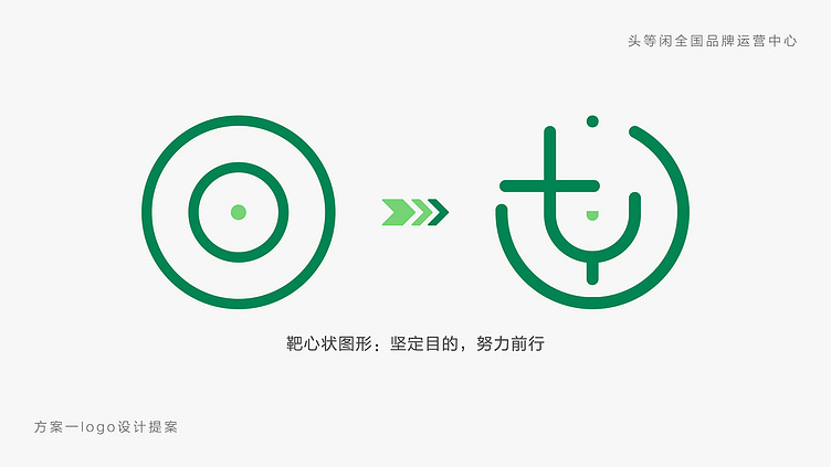
靶心状的图形,会使观看者的视觉中心向中间去靠,往记忆点去看
寓意坚定目的、努力前行的企业精神
----------
The bull's-eye shaped shape will cause the viewer's visual center to lean towards the center and look towards the memory point
Implying the corporate spirit of firm purpose and striving forward
logo旋转90°会变成一只燕子
民间中有一句俗语
燕子的尾巴似剪刀
燕子是祥瑞之物
燕子寓意着春天的到来,万物复苏,生机勃勃
和标准色相结合
使场景化的印象更加突出
----------
Rotating the logo 90 degrees will turn into a swallow
There is a folk saying
The tail of a swallow is like scissors
Swallows are auspicious things
Swallows symbolize the arrival of spring, and all things revive and thrive
Combining with standard colors
Make the impression of the scene more prominent
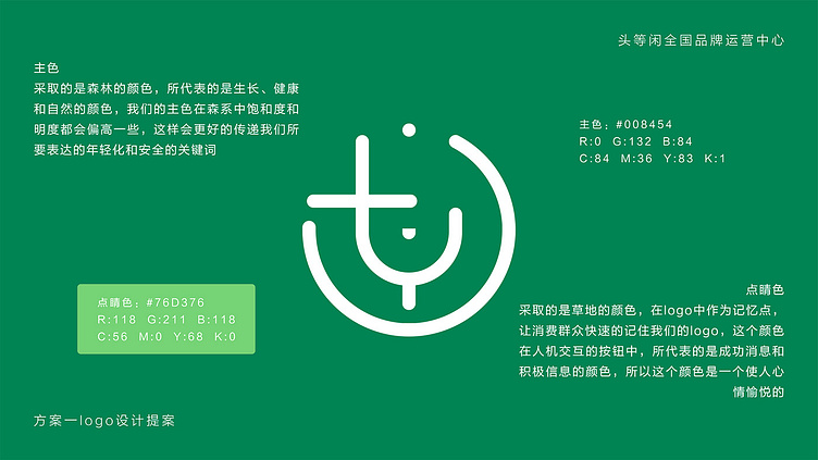
标准色为森系的颜色,但是对于正常的森系明度和饱和度更高
导致不会过于沉闷和灰暗
点睛色为草地的颜色,和主色相辅相成,不会让观看者的颜色跳跃率过大
----------
The standard color is a Mori color, but for normal Mori colors, the brightness and saturation are higher
Resulting in not being too dull and dull
The eye-catching color is the color of the grass, complementing the main color and not causing the viewer's color jump rate to be too high
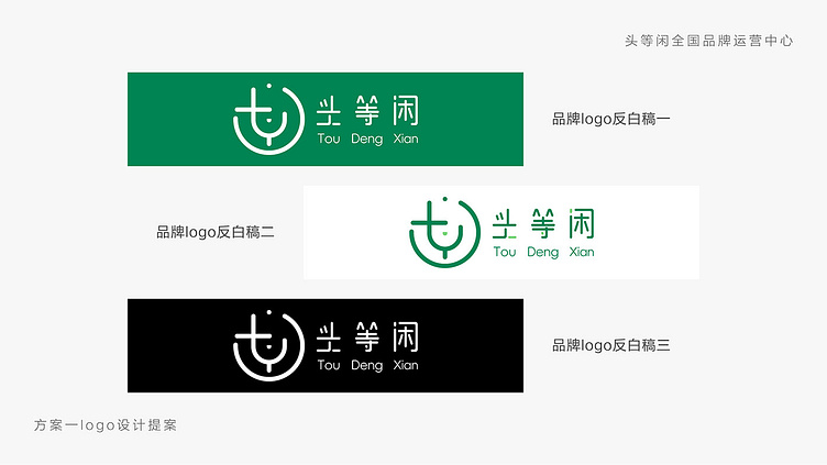
logo反白稿展示
----------
Logo backdraft display
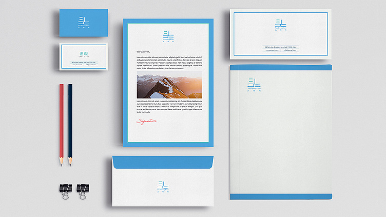
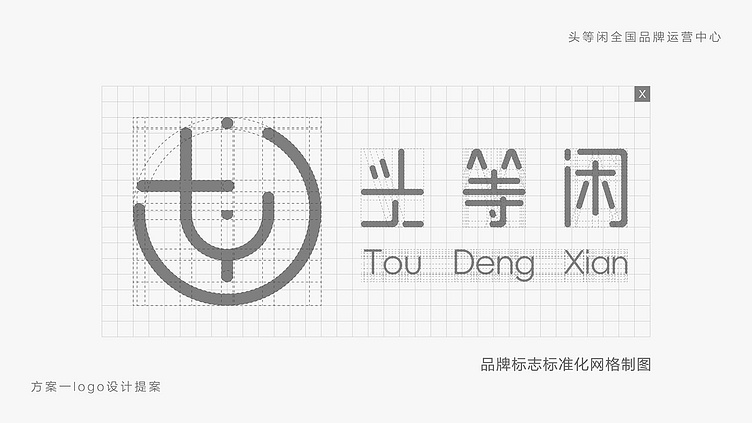
logo的规范制图展示
标准字和logo相结合,外圆内方的设计,做了独特的字体设计
----------
Standardized graphic display of logos
A unique font design is created by combining standard characters and logos, with an outer circle and inner square design
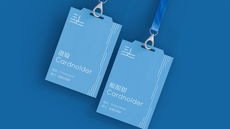
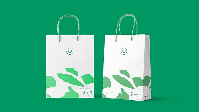
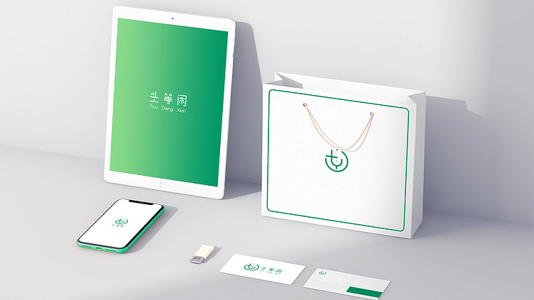
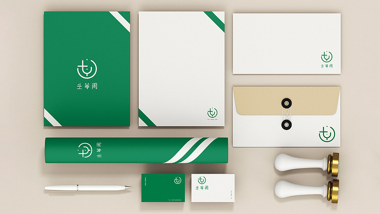
实景样机展示
----------
Realistic prototype display
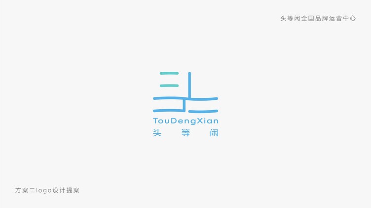
logo设计提案方案二
----------
Logo Design Proposal Scheme 2
正常状态下的Plan B的logo样式
----------
The logo style of Plan B under normal conditions
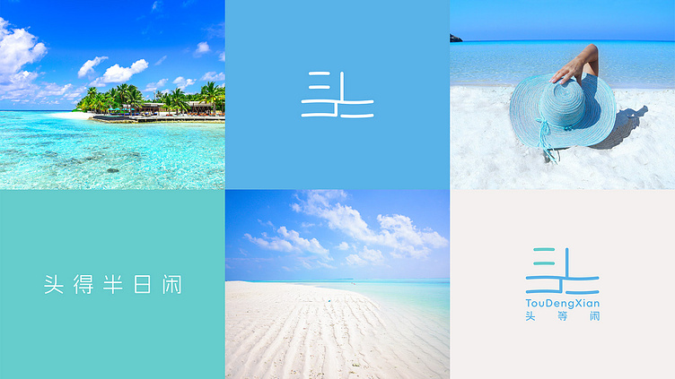
Plan B的灵感关键词情绪版
----------
Plan B's Inspiration Keywords Emotional Edition
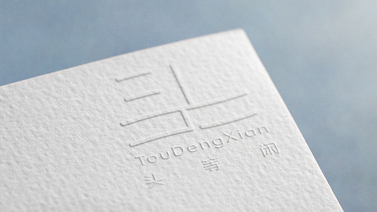
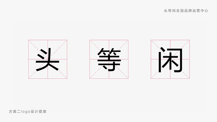
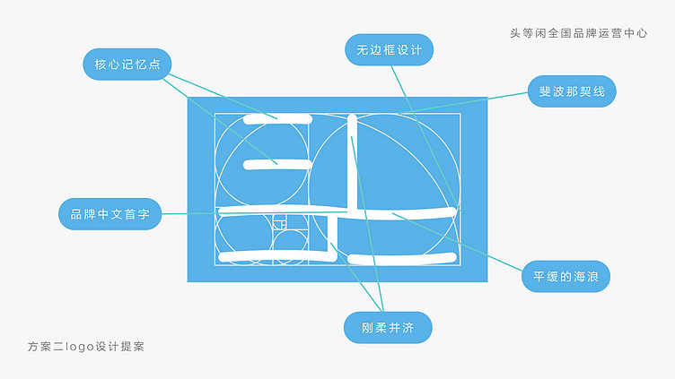
核心设计形式 —— 以头等闲的头字进行的设计
----------
Core design form —— Design with tou character in TouDengXian
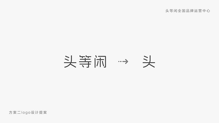
选择“头”字的原因
主要是因为“等”字和“闲”字的字体骨骼一个偏长和一个偏向正方形,只有“头”字的骨骼偏宽
主要是为了让标准字的字距拉长一些
更突显品质和放松的感觉
----------
Reason for choosing the word 'head'
The main reason is that the font bones of the characters "wait" and "idle" are slightly longer and slightly square, with only the bones of the characters "head" being slightly wider
Mainly to lengthen the spacing of standard characters
More prominent quality and relaxed feeling
logo的记忆点设计在左上角两个点上面
因为头是位于人体的最上部分
外框采用的是斐波那契线构图方式,也叫黄金分割线构图
主要的设计灵感是用头字模仿海浪的形式波动,但是幅度不宜过大,可能会使人感觉不适
无边框的设计手法是当今非常新潮的
代表年轻化的一个设计趋势
无边框的设计再结合标准色的一个场景
寓意着无边无际、自由和无限的感觉
展现出我们企业对于创新和探索的态度
表达企业的无限潜力和未来的可能性
----------
The memory points of the logo are designed above two points in the upper left corner
Because the head is located at the top of the human body
The outer frame adopts the Fibonacci line composition method, also known as the golden section line composition
The main design inspiration is to imitate the form of waves with headletters, but the amplitude should not be too large as it may make people feel uncomfortable
The borderless design technique is very trendy today
A design trend that represents youthfulness
Borderless design combined with a scene of standard colors
Implying a sense of limitlessness, freedom, and infinity
Show our company's attitude towards innovation and exploration
Expressing the unlimited potential and future possibilities of the enterprise
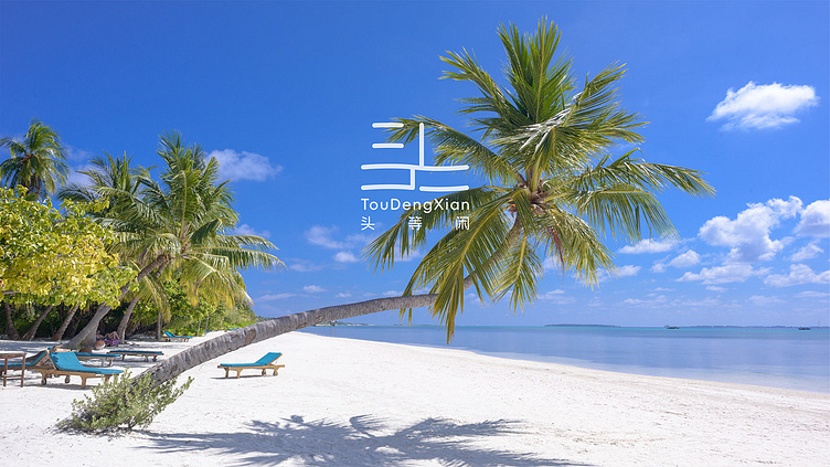
复杂的背景下,logo的展示
----------
Display of logos in complex backgrounds
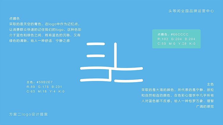
标准色采用的是大海的颜色
点睛色采用的是天空中比较少出现的青色
天空和大海的结合相辅相成,再加上无边框的设计,更使logo的场景化记忆加深
----------
The standard color is the color of the sea
The finishing color is a relatively rare cyan color in the sky
The combination of sky and sea complements each other, coupled with the borderless design, further deepening the scene like memory of the logo
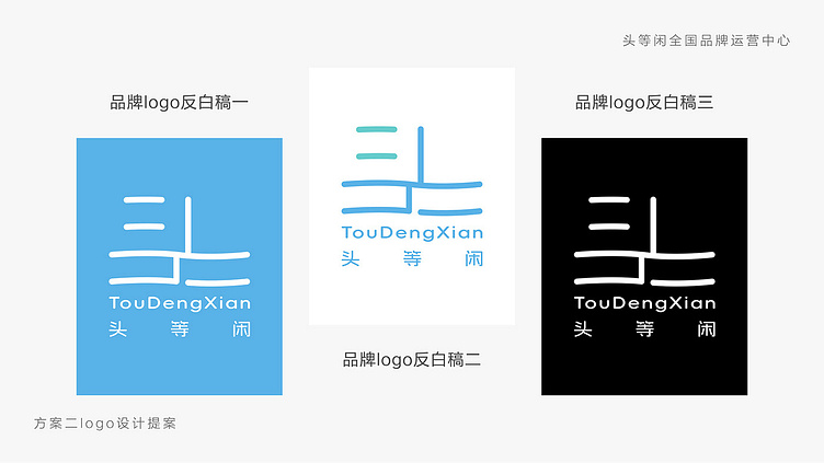
logo反白稿展示
----------
Logo backdraft display
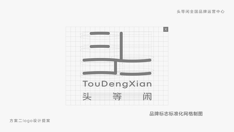
logo的规范制图展示
----------
Standardized graphic display of logos
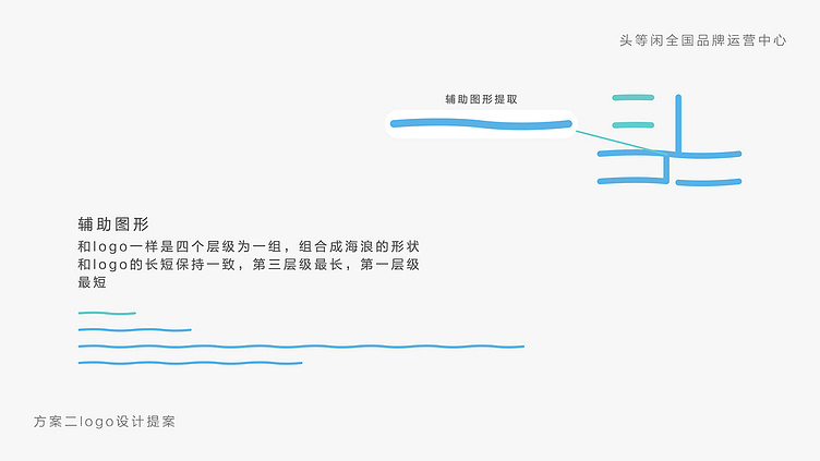
logo的辅助图形采用的是logo本身的一个衍生,但是去除了竖线
模仿海浪的感觉
但是和logo一样分为四个层级,第三最长,第一最短
----------
The auxiliary graphics of the logo adopt a derivative of the logo itself, but remove the vertical line
Imitate the feeling of waves
But like the logo, it is divided into four levels, with the third being the longest and the first being the shortest
实景样机展示
----------
Realistic prototype display