VSCO Icon Redesign

Preliminary Notes & First Impressions of VSCO
I have never used the VSCO application or any of the other similar
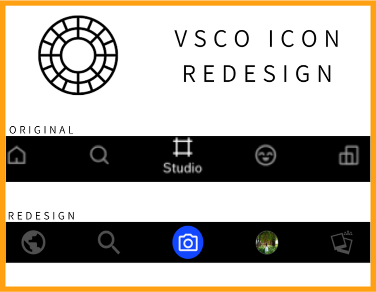
First Impressions of the original icons and the app:
I wouldn’t know what studio, profile and spaces meant upon first glance.
The application has a vintage and classy feel.
I know the app is targeted towards photographers and teenagers/young adults.
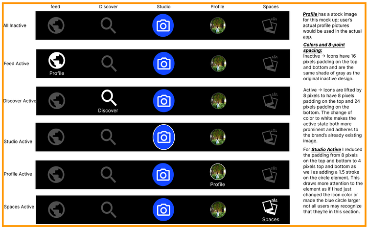
Active and Inactive Icon States
Notable Design Iteration and Decision
I decided not to add a “Studio” label underneath the studio icon as it looked both too busy and it didn’t go well with the already existing branding. I know this will make the design not as cohesive but I believe the decision was made in the interests of the users.

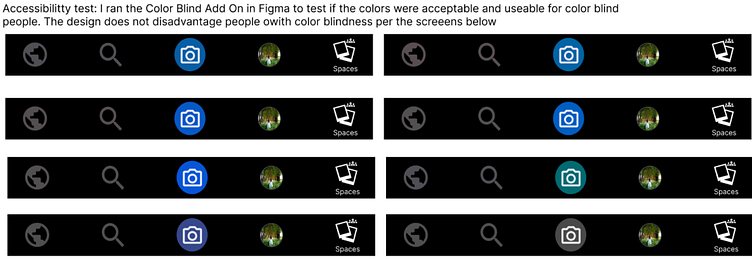
Accessibility
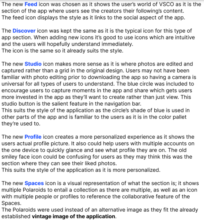
Design Rationale
Please note that I am in no way affiliated with VSCO. This project was for fun.