Brand Identity

Excited to unveil the new brand identity I crafted for "Spick & Span"! 🚀 From concept to creation, every element, including the sleek logo, is a reflection of the company's essence and vision. Thrilled to share the work of turning idea into a visual masterpiece. 💡✨
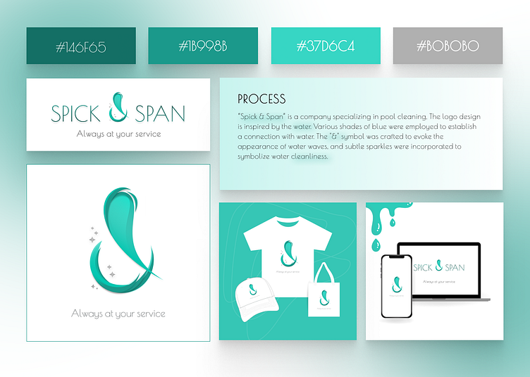
Insights:
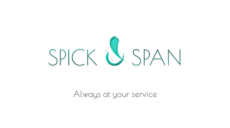
Specializing in extensive cleaning services, "Spick & Span" focuses on tasks like thorough pool cleaning and home maintenance. The logo concept was meticulously crafted to evoke a feeling of cleanliness, incorporating water wave elements to emphasize the connection to pools. Sparkles were introduced to signify both cleanliness and a bright, refreshed texture.
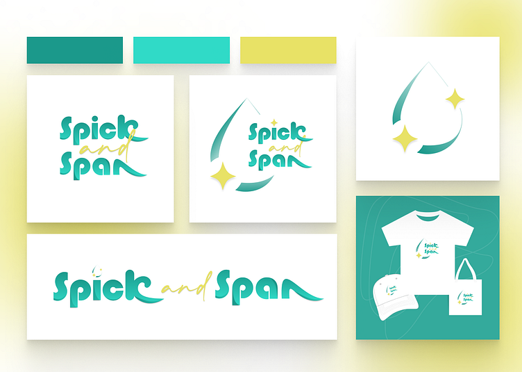
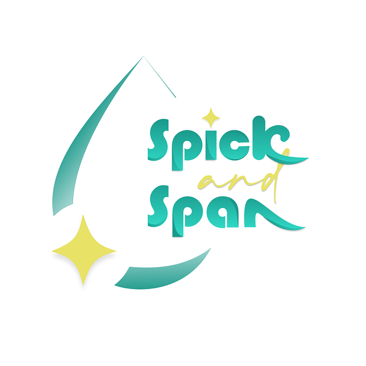
Another Variation of the Logo:
Presenting another lively iteration of the same brand, infused with a playful touch. The introduction of a vibrant "Goldvreneli 1882" brings a sense of fun and vibrancy. Incorporating a water drop not only symbolizes water but also conveys the concepts of cleanliness and refreshment, enhancing the brand's dynamic appeal.
Note: The letters 'K' and 'N' are crafted to resemble the fluidity of a water wave.
Looking to build your brand? Come work with Me.
You can also find me on LinkedIn.
OR Email me at [email protected].
If you liked my design, Don't forget to hit "L" :))
Thank You :)