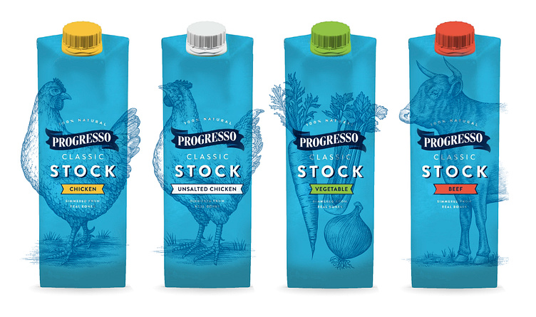
Progresso Packaging Illustrated by Steven Noble
Progresso created their new line of cooking stocks and wanted to respect their 100+ years of heritage along with their loyal customers but also appeal to adventurous cooks who want to try something new. Therefore, they decided to commission Steven Noble to illustrate this new packaging rebrand that includes their beef, chicken and vegetable lines. In order to communicate the higher quality of product inside the package, the design needed to appeal to cooks’ creative aspirations, as well as demonstrate clear superiority over the competition. By understanding that premium brands create trends rather than follow them, the result was a solution that radically broke category conventions—building on years of heritage to create a fresh, new perspective.
Using Steven Noble’s lively, classic woodcut illustrations, and modern typography and a fresh color palette, craftsmanship and love of the ingredients inside was emphasized. The side of the packaging touches on Progresso’s heritage and love for food, and gives suggestions to inspire our cooks to create their next perfect dish.


