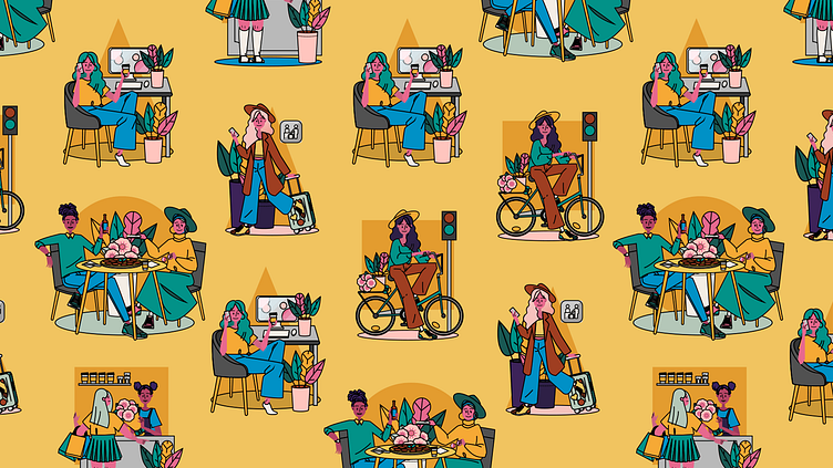
Lyyra character illustrations
Crafting a distinctive brand identity for Helsinki's new urban hub
Situated in the vibrant Kallio neighborhood of Helsinki, Lyyra emerges as a groundbreaking city block, combining sustainability, functionality, and a diverse array of offerings set to be unveiled upon its completion in 2024. The envisioned landscape encompasses brick-and-mortar business spaces, a pioneering rooftop restaurant, offices, residential apartments, and a Nordic design hotel, solidifying its status as a pinnacle of sustainable construction.
Upon winning the city of Helsinki's prestigious lot competition in 2017, Lyyra faced the challenge of lacking a cohesive brand identity and marketing strategy. Joining Ylva's esteemed marketing and communications team in 2019, I embarked on the task of conceptualizing and designing Lyyra's brand identity.
Navigating the intricacies of branding a multisectoral city block with a diverse target audience and varied functions demanded a strategic approach. Opting against creating distinct subbrands, we committed to crafting a singular brand that would seamlessly encapsulate Lyyra's multifaceted nature.
To achieve this, I conceived a collection of character illustrations, each embodying Lyyra's services, values, and intended audience. These characters engaged in activities ranging from office work to dining, effectively representing the diverse services offered at Lyyra. The character set expanded to include bikers, individuals utilizing staircases, and more, ensuring adaptability across various marketing materials, events, and features. A paramount consideration during character design was the emphasis on inclusivity, harmonizing with the distinctive vibe of Kallio.
Drawing inspiration from the unique aura of Kallio, Lyyra's brand colors were carefully selected. Greens reminiscent of Helsinki's trams, a light pink mirroring the Ihantola building, and a yellow evoking the Jugend-style constructions prevalent in Helsinki collectively contribute to the visual identity.
The fortuitous discovery that the header typeface, crafted by Schick & Toikka, bore the name 'Lyyra' added an extra layer of serendipity to the brand. Opting for the extended version of the Lyyra typeface, aligning with the architectural contours of Lyyra, we paired it with the geometrically intriguing Telegraf to create a harmonious and distinctive typographic palette for Lyyra's brand.


