Engineering System Distributor Logo Creation


[email protected] | www.maketone.design
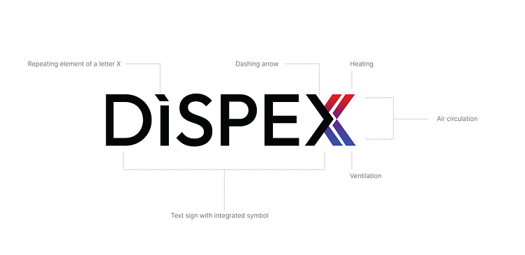
The Birth of DISPEX: A Symbolic Journey in Design
In the creation of the DISPEX logo, we embarked on a visual expedition to encapsulate the essence of a distribution company specializing in heating, ventilation systems, and supply. The result is a bold, clear, and minimalistic design that mirrors the company's commitment to precision and reliability.
Conceptual Framework:
The foundational concept behind the DISPEX logo was to integrate a symbolic representation of the company's core offerings – heating and ventilation systems. The fusion of these elements was to be embodied in a single, cohesive symbol.
Symbolic X:
At the heart of the design lies the symbolic X, a letter chosen not just for its visual symmetry but for its intrinsic representation of equilibrium. The X is crafted with precision, suggesting a delicate balance between opposing forces – the cool and calming shades of blue meeting the fiery and dynamic tones of red.
Gradient Infusion:
To further amplify the symbolism, a gradient was employed within the X. The transition from cool blue to warm red serves as a visual metaphor for the range of products offered by DISPEX – from efficient cooling solutions to powerful heating systems. This gradient not only signifies versatility but also hints at the company's commitment to innovation and adaptability.
Bold Simplicity: The design philosophy of the DISPEX logo is rooted in bold simplicity. Every line and curve were carefully considered to communicate strength and clarity, reflecting the company's commitment to delivering robust and straightforward solutions to its clients.
Clear Typography:
In tandem with the symbol, the choice of typography reinforces the brand's identity. The font was meticulously selected for its readability and modern aesthetic, ensuring that the company's name is not just seen but remembered with clarity.
Conclusion:
In the creation of the DISPEX logo, every element was a deliberate choice aimed at encapsulating the company's values, services, and commitment to excellence. The result is a visual identity that not only represents the heating and ventilation industry but also speaks to the brand's bold, clear, and minimalistic approach in all its endeavors. DISPEX, as embodied in its logo, stands as a testament to the meticulous artistry and thoughtful design process that goes into creating a visual identity that leaves a lasting impression.