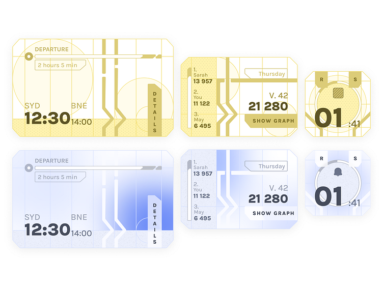
Widgets - Wireframe and Final
My initial concept for this design was to craft futuristic widgets featuring bold colors in the yellow or brown spectrum. In the early iterations, the visuals bore a resemblance to vintage infographic books and comics, leaning heavily towards a vibrant yellow palette, almost reminiscent of bananas. However, as the design evolved, I found myself drawn to an almost cardboard or paper-like aesthetic, which I now find quite appealing.
In developing the wireframes, I drew inspiration from the techniques employed by @Mike. His work, particularly in showcasing the underlying structure, served as a strong reference for my approach.
With the wireframes in place, my focus shifted to infusing vibrancy by filling the components with a colorful light blue. I opted for light blue due to its ability to convey a subtly clean and fresh feeling. This choice, coupled with the slight rounded borders of the elements, adds a polished and cohesive touch to the overall design.
