Simply Nootropics
Creating an informative experience
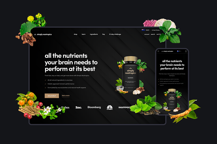
A key objective for Simply Nootropics was to deliver a brand and store with a premium feel while being as informative as possible. Nootropics have grown in popularity recently, and as one of the few brands in New Zealand offering nootropic supplements, Anthony wanted to put customers new to nootropics at ease and create an informative user experience to help guide them through to a purchase.
Complete transparency
One of the core goals for the web and social imagery was to showcase Simply Nootropics' natural roots. We brought it to life by highlighting the natural ingredients, with the goal of providing complete transparency. By visualizing raw ingredients in product hero images, along with adding sections dedicated to informing new customers of their origins, we helped remove several barriers to purchase.
Creating the brand
We wanted a modern and premium feel for the brand, with simple yet detailed imagery. By playing with the name and core values of Simply Nootropics we created a clean and simple logo mark with multiple layers of meaning. We also wanted the packaging to stand out from traditional supplements. By reducing the information on the bottle to only vital details, we were able to offer a clean and instantly recognizable design.
Mobile-first design
With mobile e-commerce sales rapidly increasing, it was crucial that we design the website mobile-first. We paid special attention to the visual hierarchy of key information and the overall user experience to ensure users were confident in the brand and that the journey to purchase was as smooth as possible.


