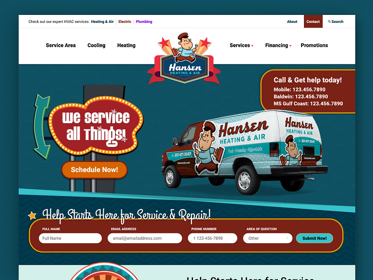
Hansen Air | Hero & Navigation Re-Design
The ADA Compliance nightmare site gets an upgrade.
Check out what small things can do to your site that help your ranking.
The Clean Up From Hell
_________
The previous live site was an ADA compliance nightmare with the variety of colors and patterns as well as font styling.
The first step to updating this page is to establish a guidelines panel. This will contain all colors, a new font family, and asset graphics to use above the fold. Hansen has documented approved color tiles that their logos can be used on (as seen at the top of the graphic below) and supplied assets to stay inside the components above the fold as well as the one font they wish to keep as more accent focus, Grand Hotel.
The Hunt For a Right Font
_______________
Why Refresh the Font Family? Currently, the live site is using up to four different font families for a variety of components or inside the same area. Their reasoning? To make the content legible with their bold, busy textures. To adapt the site to a more user-friendly layout, the choice to find a Google Font will allow the client to have a variety of weights to adjust accordingly to the background textures selected in the backend.
Characteristic styles to avoid? Thick strokes, compressed letterspacing, and minimal interior counter form are specifically aimed, as its name suggests, to "have an impact". The impact style fonts on the live site have a high x-height, reaching nearly three-quarters of the capital line. Ascenders are short, and descenders are even shorter. To make this styling easier to read, you would have to adjust the character spacing as well as the line spacing.
Why Roboto? Roboto has a dual nature. It has a mechanical skeleton and the forms are largely geometric. At the same time, the font features friendly and open curves which aligns with the voice the company wishes to move forward with for their clients.
Navigation & Component Refresh
_______________
Goals of this refresh was to bring the site overall to ADA Compliance. This meant a lot of the main navigation had to change seeing as most of the current site did not pass when tested.
What They Like Currently:
Focus on the vehicle all their technicians will be arriving on location in
Quick number CTA on landing
The form generated for repair requests, keeps styling
Their textures/container angles
Navigation dropdown interaction with keeping the same levels.
What They Want to Change:
Ability to freely change the button inside the "We Service all Things" signs (the current one is an image they upload every time to change the button) as well as the call information with a possible headline above to change out to match their running campaigns.
Generally more white and ADA compliance rating of at least AA.
Designer Takes A Wack At It
_______________
_______________________________________________________________________________
Review more works from Blue Fish inside this collection of work


