Judo Community Centre


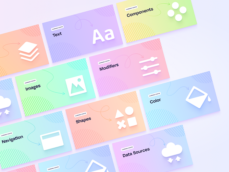
We developed a set of covers and icons or the Judo community center. These graphics represent each of the three sections: Community, Product, and Learning Center. While each set has its own unique feel, they all adhere to the brand guidelines, encompassing the colour palette, graphic styles, and fonts.
The Community section utilizes the classic Judo palette, the Product section pops with brighter, more saturated gradients, and the Learning Center adopts a more subdued and simplistic approach. The iconography set was created to visually rhyme with the covers design.
Want to take a closer look at Judo case study?