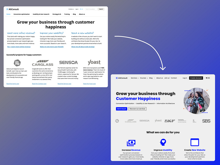
Website Re-Design
As you can see, the website of AGConsult is violating a lot of UX/UI rules, while claiming to be a UX/CRO Company. From bad color contrast choice (light blue, accessibility issue) to information overload, to a bad visual hierarchy, bad font choice (accessibility issue)...
That's why I quickly made a re-design mockup to show you how it could be improved with some simple changes like a better blue color with a higher contrast, use of a great image that makes the statement or value prop more convincing, better typography, usage of primary, secondary and tertiary buttons...
More by Olivier Leirman View profile
Like
