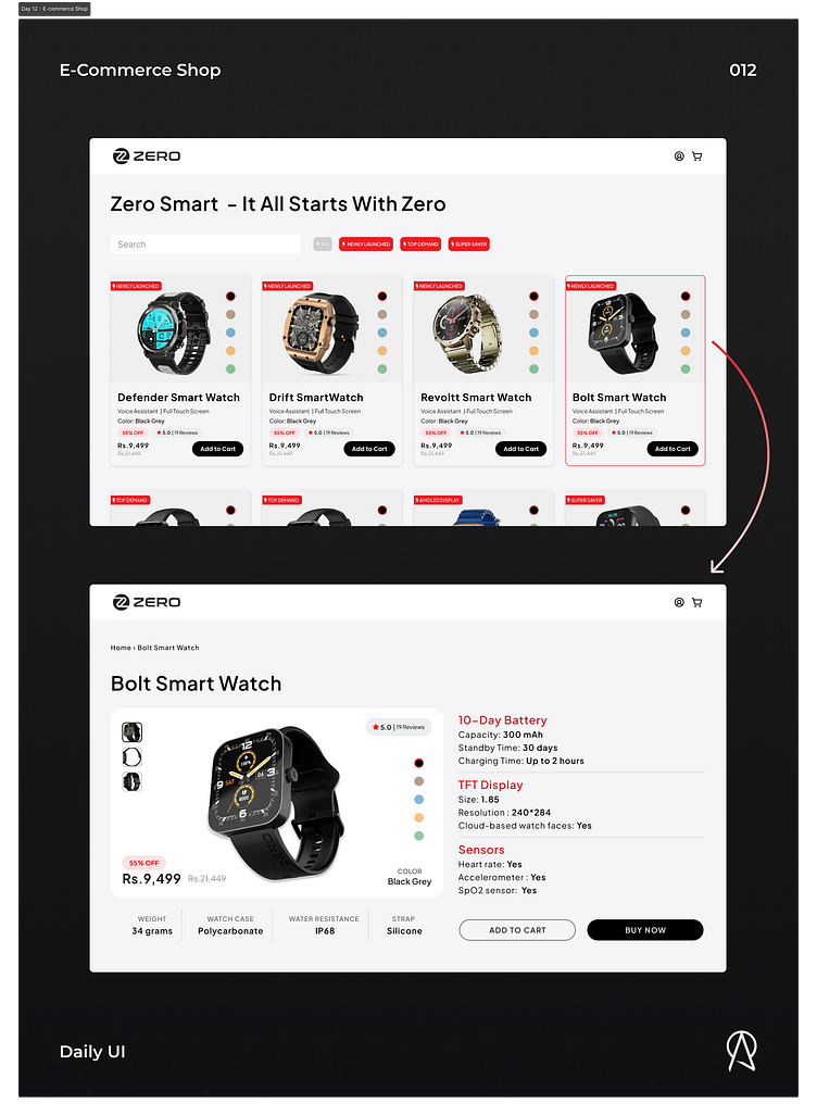
Daily UI - E-commerce Shop
The ZeroLifeStyle shop, redesigning the watch cards for better use of typography and negative space.
The ZeroLifeStyle shop, redesigning the watch detail page's main section. I added the main features of the watch at the top as highlights. I updated the preview card with color selection and preview from different angles: improved typography and overall visual hierarchy and design.
Hey, Abdullah here 👋🏻
How's it going? I hope you liked the work, if want to connect, need help with something, or share some thoughts? Message away!
More by Abdullah Qureshi View profile
Like


