Kōha logomark
Kōha logomark
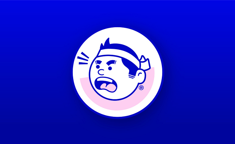
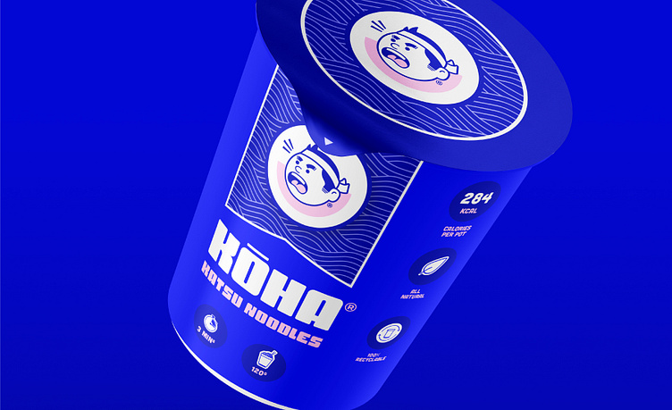
This logomark was inspired by Japanese food packaging. In Japanese, the name Kōha refers to people who are "hard", "strong," or "tough", and is named after the angry Kōha Chef logomark mascot.
Kōha logomark
This logomark was inspired by Japanese food packaging. In Japanese, the name Kōha refers to people who are "hard", "strong," or "tough", and is named after the angry Kōha Chef logomark mascot.
