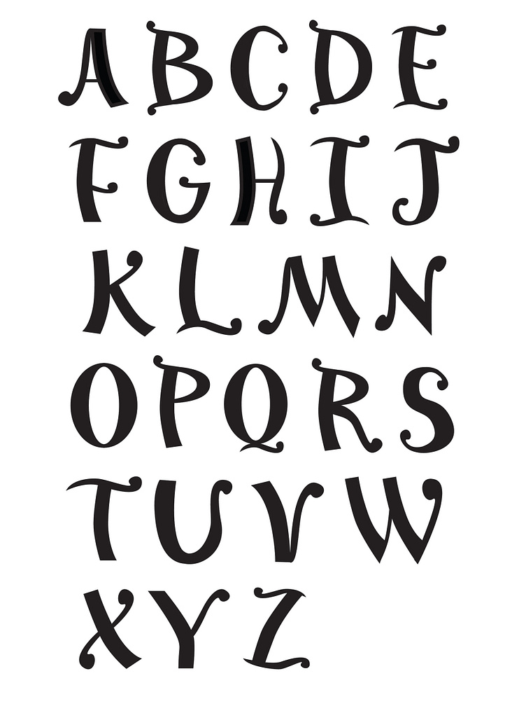
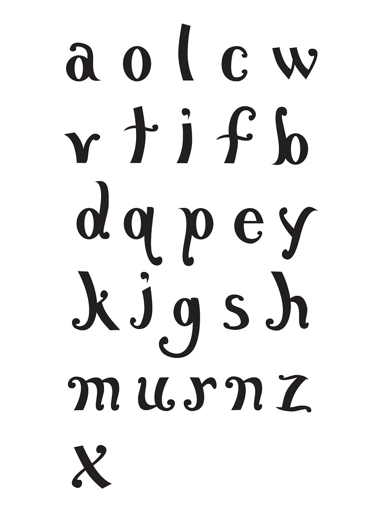
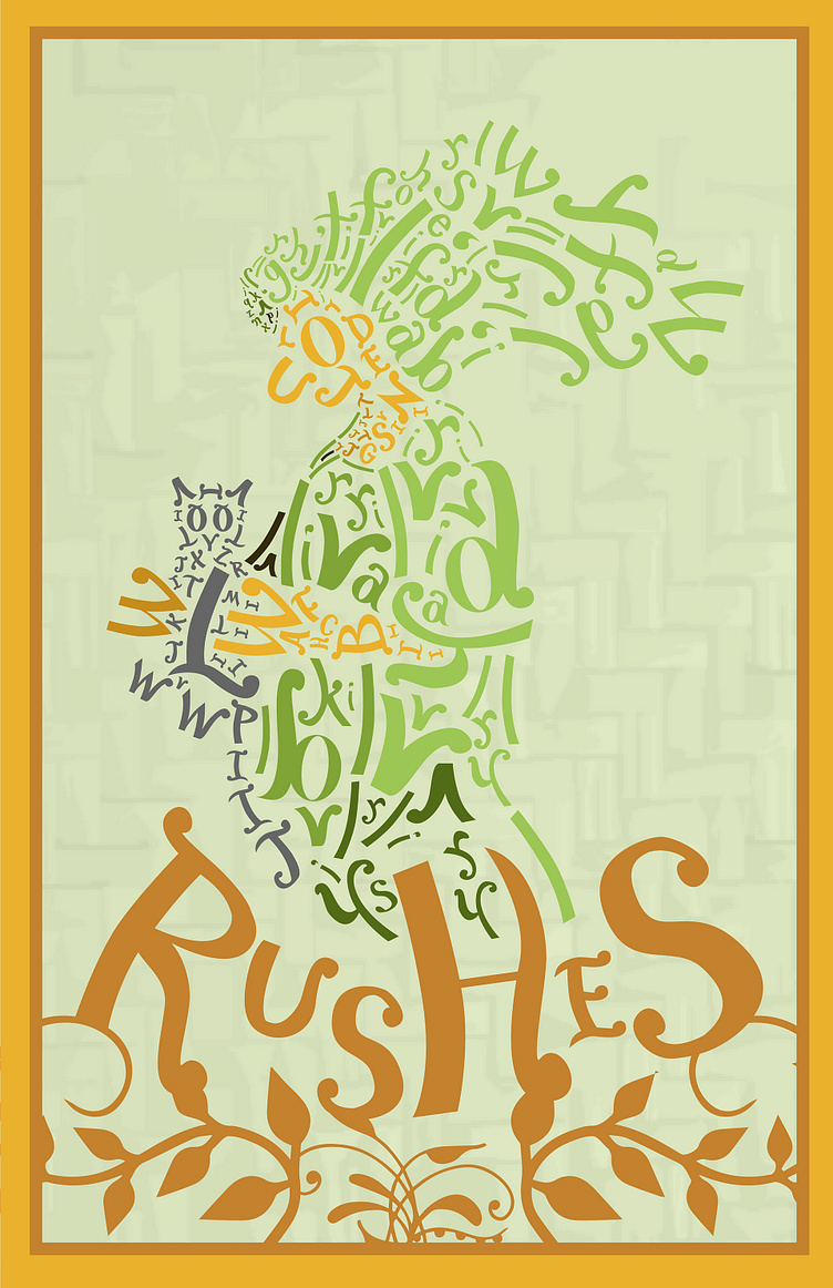
"Rushes" Typeface
Inspired by the English fairy tale Cap-o’-Rushes, I was determined to create a custom typeface that represented the themes and world of the story. After a process of various revisions and modifications to hand-drawn lettering, the final product reflects the rushes (floral) elements of the title character’s appearance and the sense of blooming transformation noted in the tale.
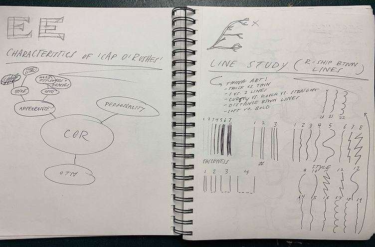
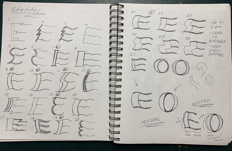
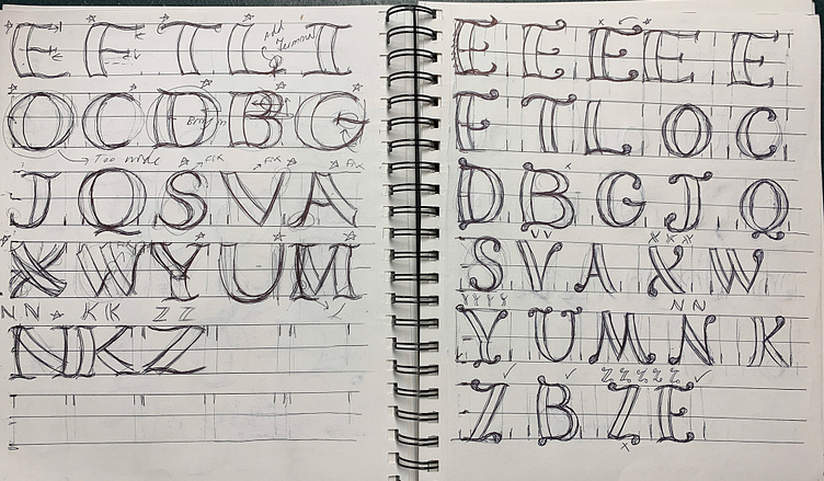
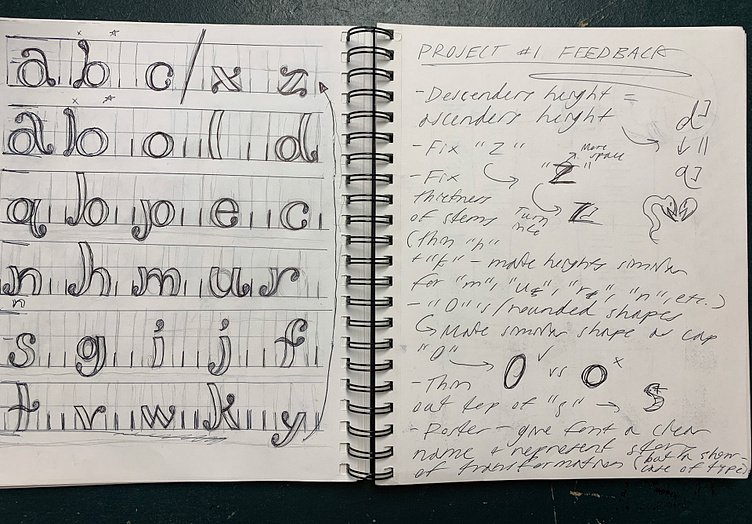
Creating the typeface started with reading to get a sense of the themes, imagery, and concepts included in the tale. Once I read through a couple of times and got a sense of what it was about I proceeded to make a series of sketches surrounding the look of the type and seeing what formats would work best. After I narrowed down a few options, I settled on one that related to the natural appearance of the Cap-o’-Rushes and refined it with vectorizing in Adobe Illustrator. Beginning with simple, foundational letter forms (such as i, o, and t) I continued to create the entire alphabet both in uppercase and lowercase. I revised these forms to get them finalized and then prepared them for their inclusion in poster that showcased their forms and the story's messaging.
The typeface poster was an exhilarating end to the project. It turned out to be a great lesson in typographical design and a comprehensive showcase of my typeface's appearance. Even including both Cap and her cat within the design as well as some natural forms and flowers related the lettering back to the tale I read and gives it an even further sense of depth and personality. Not only did I end up with a unique piece to add to my portfolio, but I ended up learning more about working with custom typefaces.