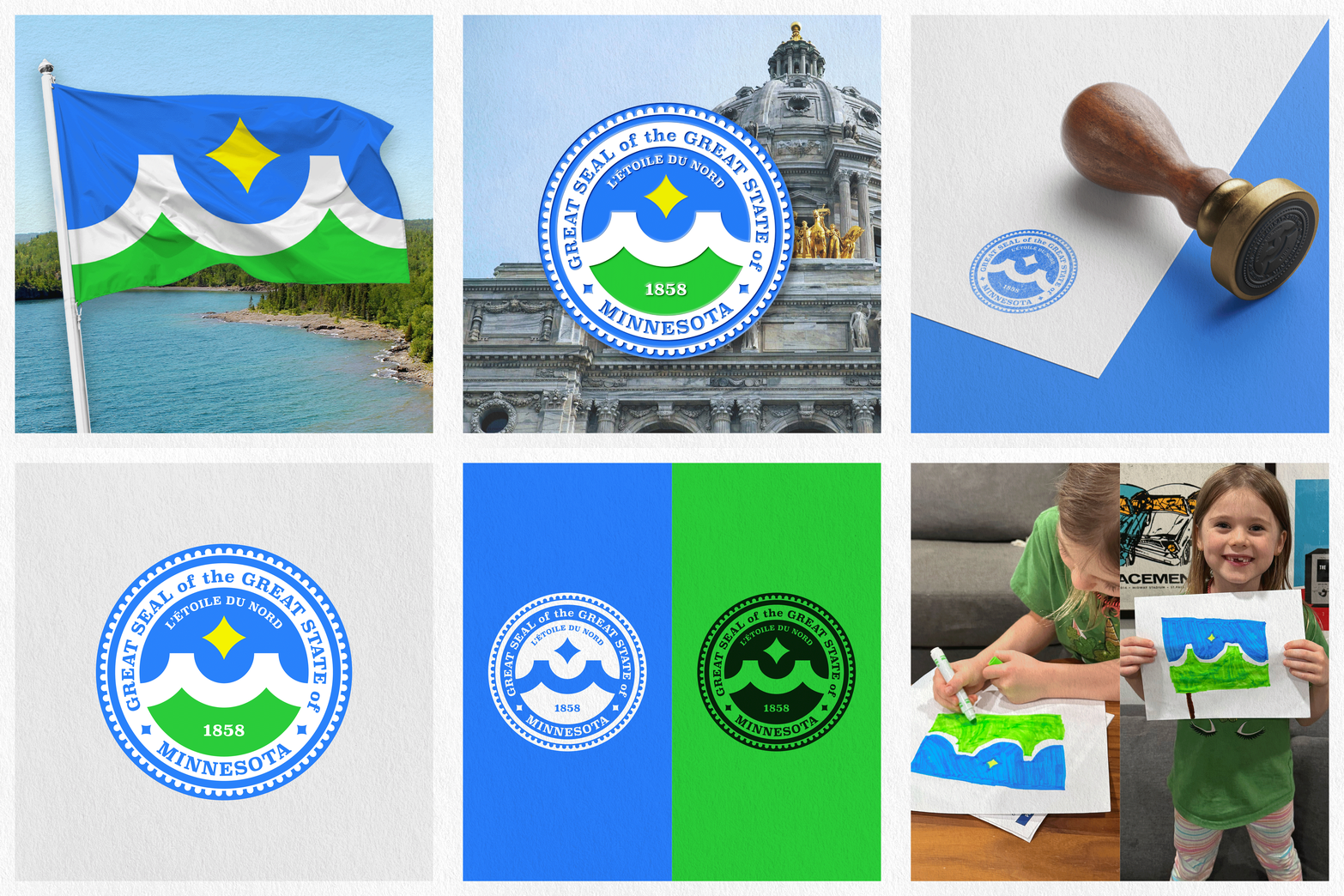
Minnesota State Emblems Redesign
I have recently been spending time on updating MPLS MINN DESIGN Co. brand. In doing so some of my sketches turned into an option I figured I'd toss in the hat for the Minnesota State Flag and Seal redesign. That said, I am sure there are shared thoughts and/or elements by many but this is my interpretation. It's been a blast reimagining what this could be
Star of the North:
The direction and purpose of the state's motto, L'Etoile du Nord. Just as Polaris represents steadfast guidance in the night sky, Minnesota shines as a beacon to the nation.
The Mighty "M":
Where sky blue waters meet fertile green shores, a snow white "M" carves out space, symbolizing three icons of Minnesota. The cresting waves of the state's lakes, the soaring tops of its Red Pine, and the reflection of the Stone Arch bridge in the Mississippi River, connecting diverse, unique communities across the state.
Sky Blue Waters:
The strong, deep blue of Minnesota’s myriad waterways, used for commerce and recreation. Of Lake Superior, where ships from across the world pass under Duluth’s Aerial Lift Bridge. Of Lake Itasca and the headwaters of the Mississippi River, where the country's most important agricultural conduit finds its source. Of Bde Maka Ska and Minneapolis’ Chain of Lakes, ringed by runners in the summer and nordic skiers in the winter. The blue waters of Minnesota represent the state’s strength, abundance, and pride.
Bountiful Green Prairies:
This green grows from healthy earth. Farmers work to raise and harvest crops that help nourish a nation. A lush, verdant landscape gives room for city, state, and national park systems that are among the best in the country. This vivid, vibrant green exemplifies the thriving nature of Minnesota and Minnesotans.
