Beşiktaş
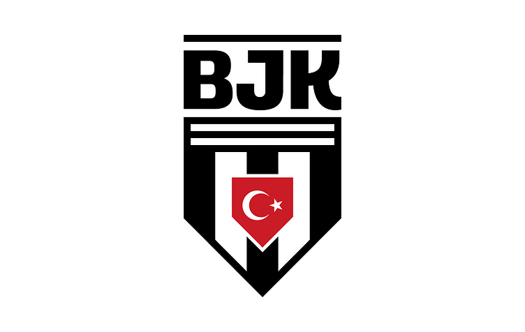
I'm thrilled to share the unveiling of a fresh logo for Beşiktaş JK, a project I've led. This new emblem beautifully marries tradition and modern design, inspired by the club's original logo from its founding year in 1903.
I've opted for a sleek, contemporary font to present the club's name, preserving its rich history while exuding sophistication. The inclusion of the Turkish flag's shield takes center stage, symbolizing both national unity and the club's enduring pride.
Vibrant, authentic colors have been introduced to revitalize the logo. A notable change is the removal of the founding year, graciously acknowledging Beşiktaş as Turkey's oldest club.
This rebrand is a carefully crafted strategy that respects the club's legacy while positioning it for a brilliant future. It unites loyal fans while extending a warm welcome to new ones, forging a timeless connection across generations. Together, my design work and the club are embarking on the next chapter of an illustrious history, where tradition and innovation coexist harmoniously.